5 integral components of a great email capturing pop-ups
Email marketing has the highest customer retention and conversion rate even when compared to organic searches.
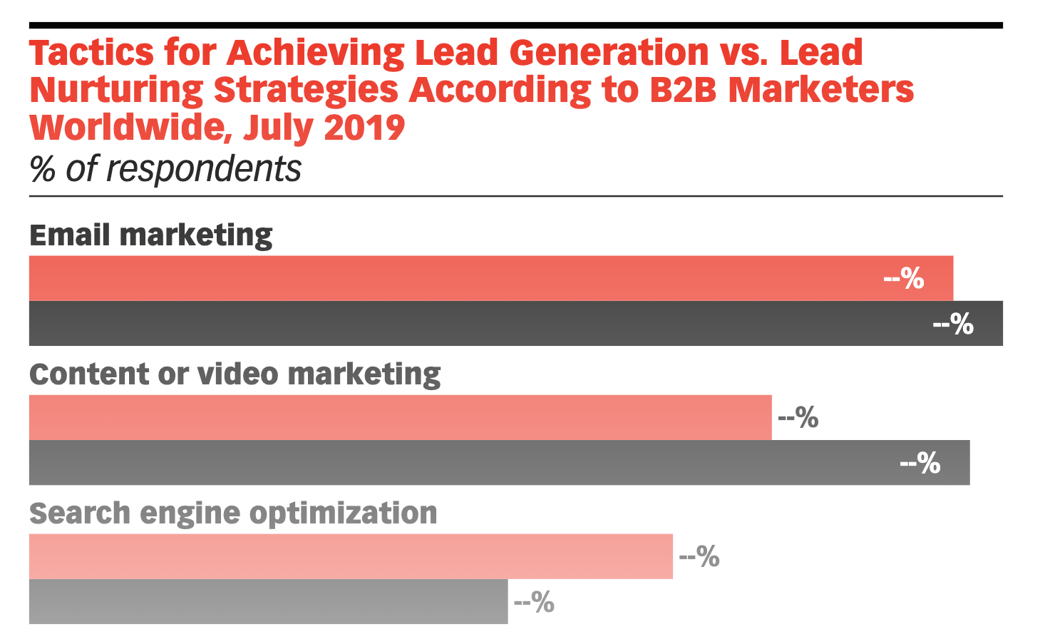
Source: emarketer
Why is that?
Email marketing is a rather personal method of communicating with your prospects. Also, around 38% of the world’s population have email IDs.
Of the 200 billion emails sent every day, over 60% of them are business emails. This is a huge number.
Colin Nederkoorn, founder of customer.io has openly stated emails marketing is by far the best way to nurture your leads and convert them into loyal customers.
Email marketing is way more effective than social media because of social media as a platform is meant for personal communication and not with a business.
Don’t get us wrong though. Social media is a great place to market your product and bring in customers, but not as effective as email marketing.
Besides, emails are cheaper, highly customizable, uncensored, and highly measurable.
BUT THE BIGGEST PROBLEM IS CAPTURING EMAILS!
Who would you write to if you did not have any details of people even slightly interested?
This is where Qualzz comes in with an easy way to increase your email list with the help of POP-UPS!
Pop-ups are highly efficient on multiple levels. There is a whole science behind pop-ups.
Firstly, it aids visibility to your contact form. Your visitors do not have to go looking for it. It also promotes your lead magnet.
But there are other integral properties of a good pop-up and in this article, we will boil all of them down so that you can digest it easily.
5 important things your pop-up needs.
1. Reliant Marketing
Why have we used the word reliant here? It is because you need to reflect your marketing even in your pop-ups.
Does not matter if you are just starting with your venture or have been in the game for some time, you are sure to have a strategy.
This strategy should reflect with your pop-ups.
Ever heard of brands that only sell products and/or information on days like Black Friday? Ever see how their pop-ups generally surround around fear of missing out?
Here is an example…
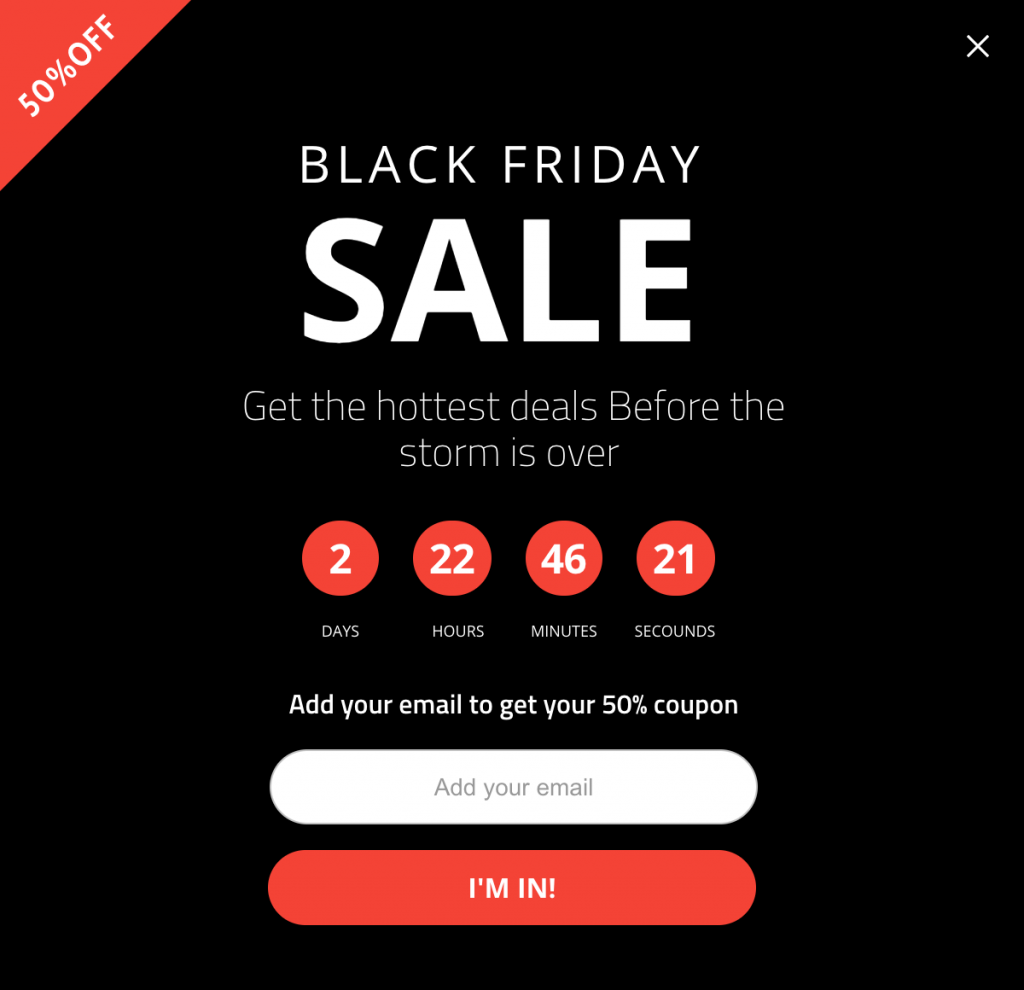
Source: Adoric
This a great pop-up on multiple levels. Before we reason out why we think this is a great pop-up, take your time and reflect on the same.
- The black background stands apart firstly. How many websites you know use black as a theme?
- The countdown timer is a great touch. It helps instil a sense of urgency within the visitors.
- Great CTA. Makes the lead feel included in an unparalleled.
- Clear value proposition. (more on this later)
The owners of this Black Friday sales website know exactly who their target market is and have designed the pop-up in accordance.
This is what you need to do with not only your pop-up but with all front end interface.
We at Qualzz help you perfect your pop-ups to increase your email list.
2. Vivid Imagery
An image can speak way louder than words can and sometimes they project ideas way better than words ever can.
With this in mind, vivid imagery (if applicable) goes a long way and help in multiple ways.
Visually grab attention.
Images help grab attention. Often times, any pop-up receives a prospect’s attention on the image first and then on the content.
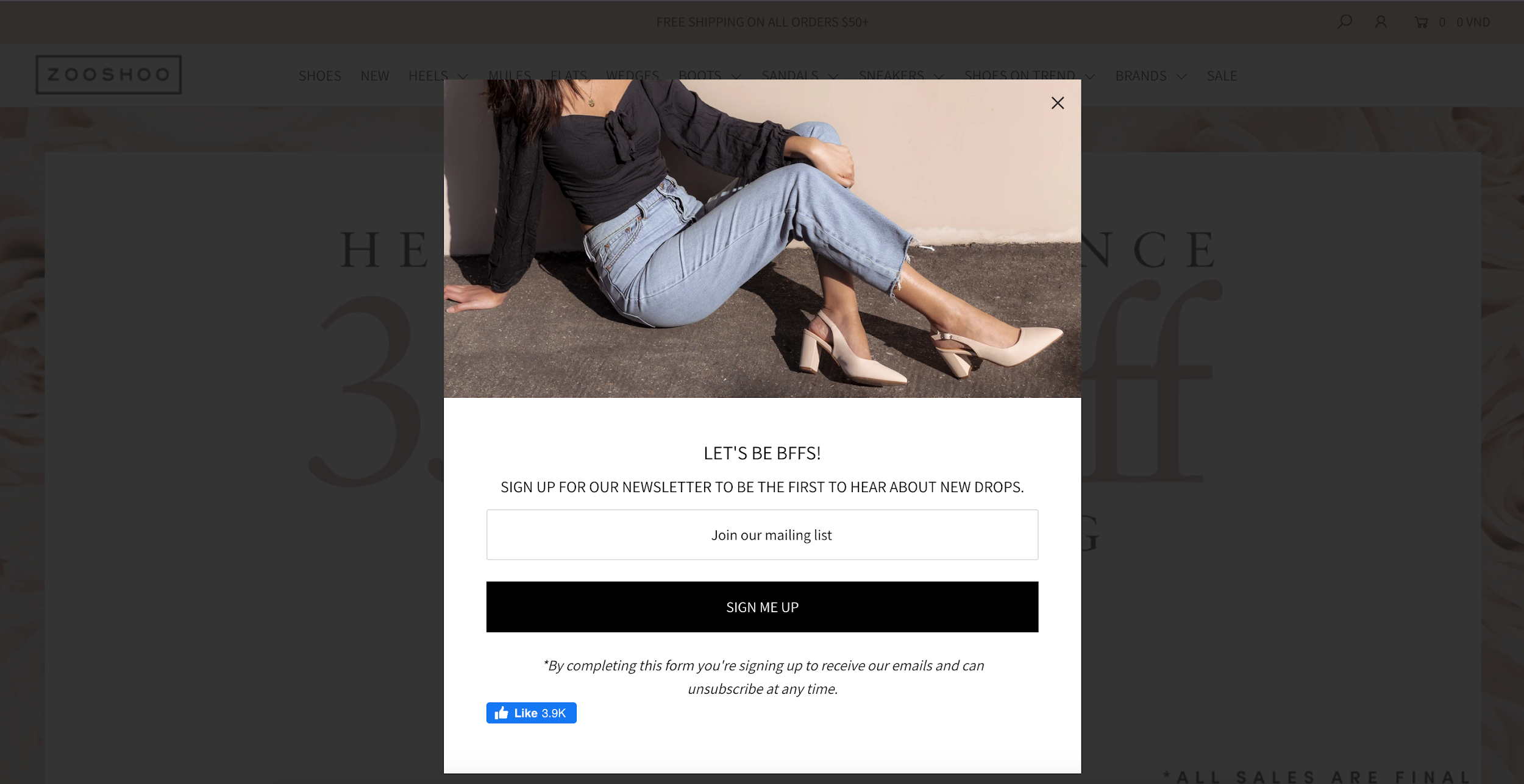
Source: Zooshoo
With Zooshoo, they do not even need to mention the product they are selling as the image pretty much justifies it all.
Showcase products.
You can promote the theme of your website as well as your products with your images. Take a look at this website selling candies and lozenges.
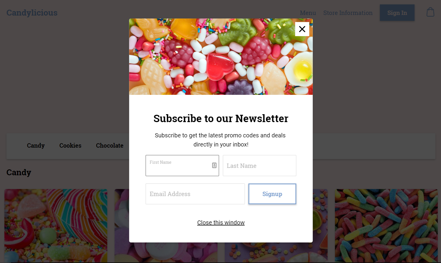
Source: Oodle
Images render as a great way to speak less but communicate more. Having said that, if you are selling services, you can look into infographics.
Images can make the whole difference when it comes to pop-ups but might not be the best option everywhere.
With the Black Friday pop-up example, there are hardly any images that would have complimented the whole theme.
Hence, do not flood your pop-ups with images unnecessarily. You can read more about the best strategies on capturing email signups here.
3. Impacting propositions.
Your traffic would only give up a prized possession (think: contact information) in exchange for a benefit.
Now with different industries, these ‘benefits’ aka ‘value propositions’ could be different.
While most of the SaaS brands introduce a part of their intellectual property or a subscription discount, other tangible goods brands have discounts and membership value.
Nevertheless, these propositions need to be highlighted.
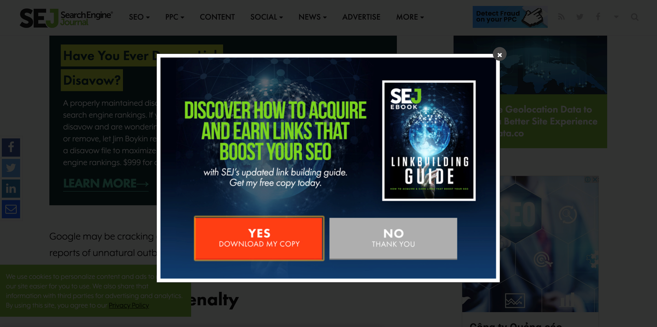
Source: Searchenginejournal
Above is a good example of a very well focused offering. It is in bold, capitals and also has a flashy lime green colour which is hard to miss.
So make sure you draw inspiration from these well-crafted pop-ups.
4. Branding
Your website has been designed keeping a plethora of factors in mind, right?
From the fonts used to the colour scheme. Everything that is on your website has a purpose which makes your brand.
Hence, even your pop-ups should have the same consistency as your website.
Look how a simple change in font can alter the meaning of a simple sentence.

Source: Reddit
You can experiment with your pop-ups but do not shift from the core brand value.
For example: If you are a luxury brand you do not want your pop-ups to be looking childish.
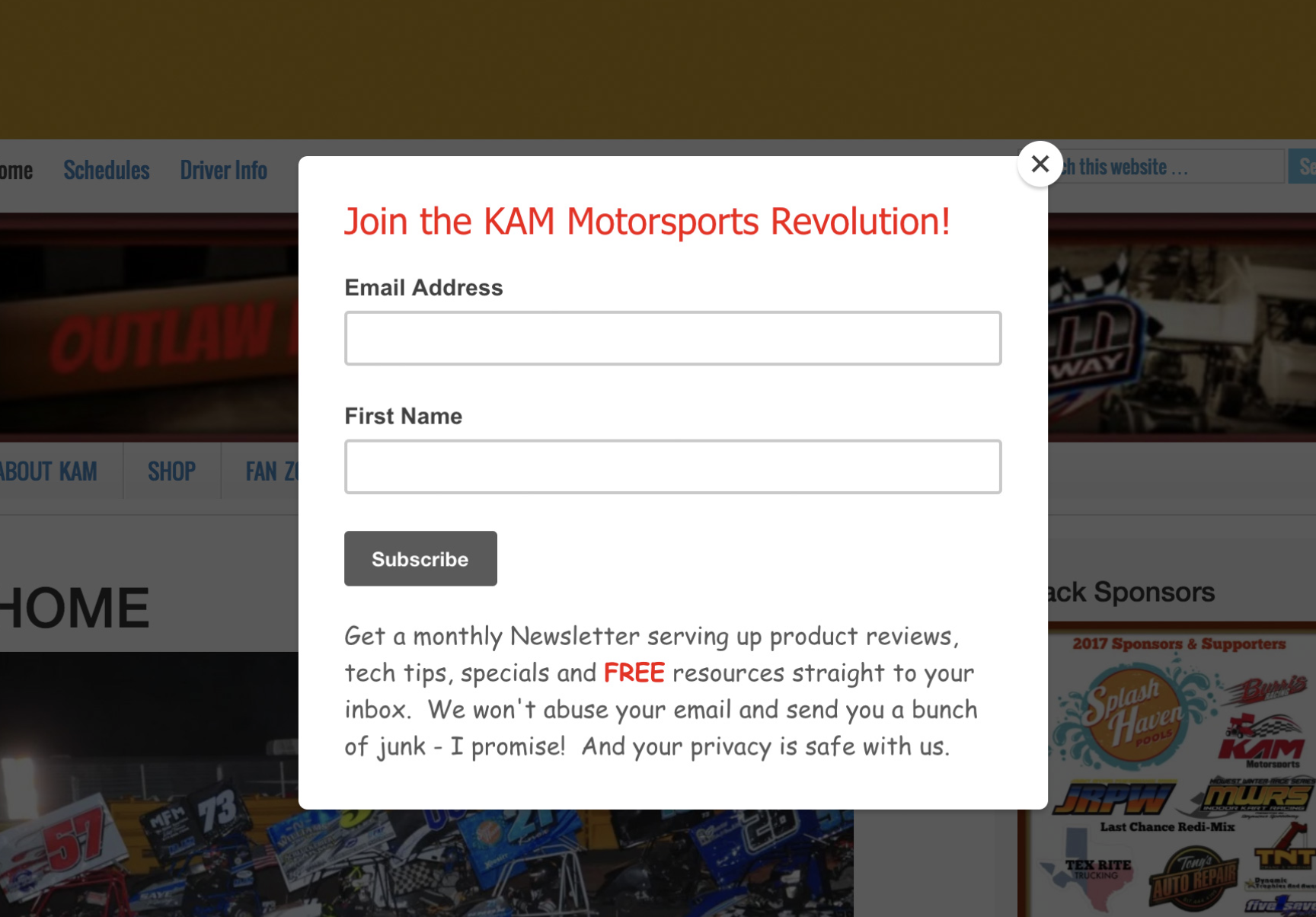
Source: KAMmotorsports
Comic San MS? Really?
This pop-up really does not match with the branding of the company. Besides, the font is not the only problem with this one.
The value proposition is not clear. The colour schemes are completely off and also the content is not reinsuring.
Your brand is everything. Helps instil trust and produces loyal customers.
Though annoying for some, pop-ups do work.
5. Clear prompt to action (CTA)
Do not just leave space for people to give up their details but prompt them too.
Having a clear call to action helps by eliminating the paradox of choice. By giving your visitors too many options, you will not be able to convert your prospects on a higher rate.
In today’s age where the average Joe has many options and competition is high, you need to draft a CTA that is not generic.
Here are some ways you can make your CTA even better.
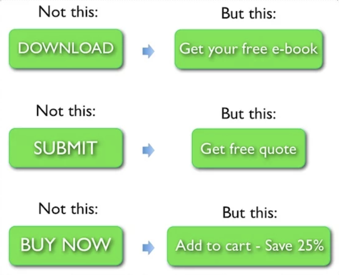
Source: Neil Patel
Even though all the buttons in the example above are requesting the visitor to take the same action, they are crafted rather well.
Your CTA needs to show the benefit of them taking an action which is favourable to your business.
Stop losing money now and start building email list.
Concluding on 5 integral components of great pop-ups to capture emails.
Listed above are 5 tips of great pop-ups but not every pointer could apply to you.
But knowing them helps you build better pop-ups that help your business grow by increasing your email list and building a loyal fanbase.
With Qualzz you get the freedom to choose your pop-ups and customize them according to what you think is right.
We always say this, “ No one knows your business and brand better than you do”.
We facilitate all the intricacies for you so that you have an effortless time designing singular or multiple pop-ups.
Dive into the world of pop-ups and change the face of your online business.
Does not matter if you are just starting with a website or have a well-established one.
We have a plethora of services.