
How to Create Highly-Performing Mobile Popups Without Hurting Your SEO
People that say mobile popups are annoying and intrusive are the victims of those poor-performing, overly aggressive ones. However, not every popup interrupts the site experience. It all boils down to how you create it.
In fact, compelling mobile popups can actually help you enhance your visitors’ experience. It means it can be an extremely powerful marketing tool to build your email list and grow your business when you use it responsibly and thoughtfully.
But, creating high-performing mobile popups isn’t all smooth sailing. It’s not all about making it less intrusive but also optimizing it so it wouldn’t get any penalties from Google.
Now, the question is: how to create mobile-friendly popups that really work?
That’s what this post is for.
In this article, we’ll talk more about the importance of good mobile-friendly popups and how you can create an effective one without harming your SEO efforts and putting your visitors off.
Why You Should Care About Mobile Popups?
Let’s admit it. We are glued to our phones. It feels like it becomes our vital organ. Doesn’t it? I bet you’re one of us too.
This rapid growth of mobile-first behavior fuelled the explosion in the number of mobile-friendly marketing — this, in turn, has a highly increased demand for mobile-designed popups. That’s where savvy marketers like you should step in.
Don’t take my words for it. These following numbers on the stats speak for itself:
- Mobile devices generate 52% of the total global internet traffic, taking over desktop browsing.
- US adults spent about 3 hours and 30 minutes a day using the mobile internet.
- More than 83% of mobile users say that a seamless experience across all devices is extremely crucial.
- At least 91% of internet users use mobile devices to go online and access websites.
Interesting, isn’t it?
Those staggering numbers above show you that creating mobile popups is a relevant strategy you can tap into. In other words, you must leave no stone unturned in catering to mobile users, whether it involves popups.
Best Practices to Create Mobile-Friendly Pop-ups That Convert
I’ve slightly mentioned the Google penalty for “intrusive interstitials” for mobile web pages. Creating over aggressive mobile popups can lower your rankings, which leads to the poor performance of your traffic and sales.
The point here is not to ban all mobile popups. Instead, it acts like a reminder that you must keep it easy.
Don’t fret.
These best practices below can help you avoid Google penalties and craft highly-converting mobile popups:
#1. Use Intriguing Copy
The copy or text you’re going to put on your mobile popups is one of the most crucial reasons whether users close it or not. In this case, you need to use an intriguing, thought-provoking copy to make them fill the form.
And since mobile users have an even shorter attention span, make sure you keep it short and sweet. Not to mention that you also have a smaller space to work with, so you must keep it really minimal but impactful.
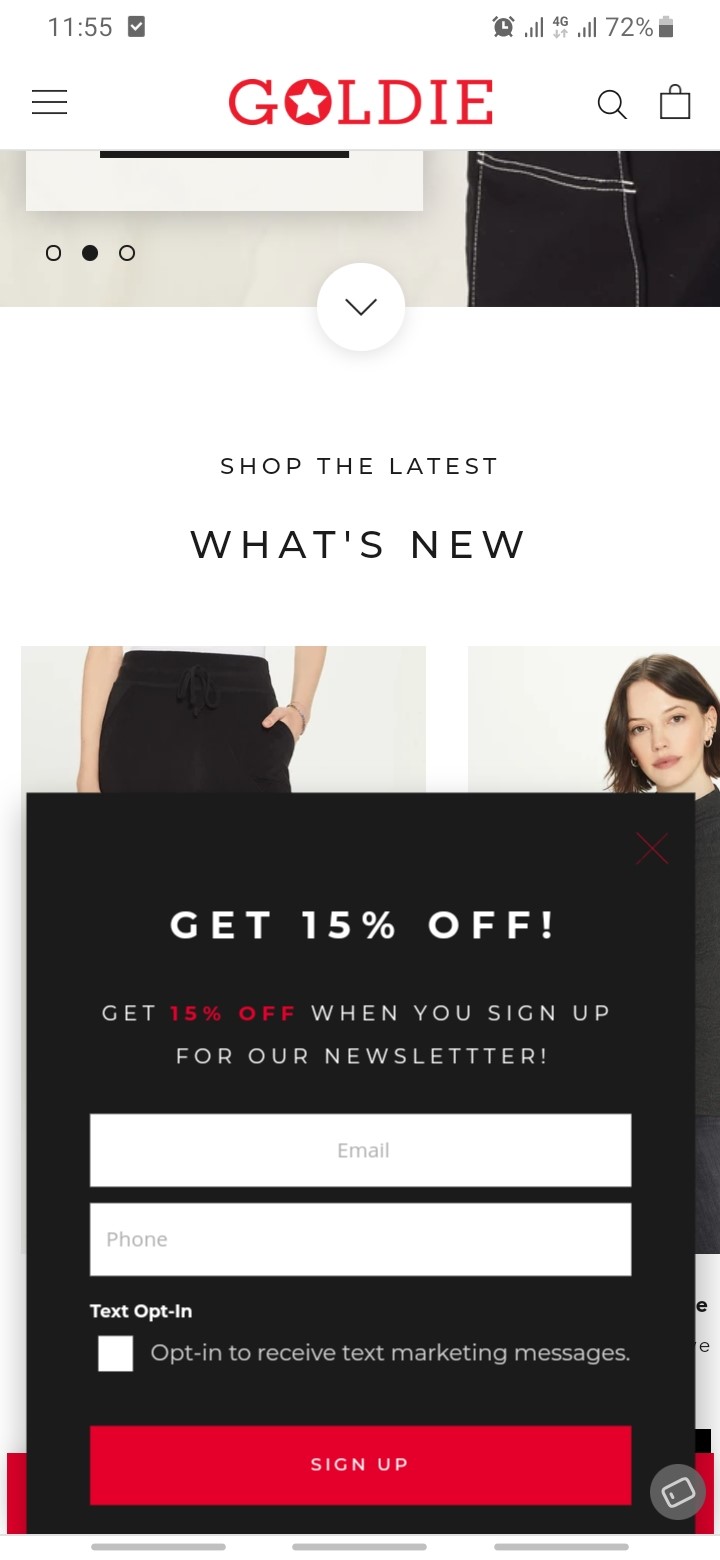
Take a look at this convincing example from Goldie below that offers 10% off when visitors sign up to their newsletter. Who can miss that deal?
#2. Pick the Ideal Format and Position
The most crucial key while creating mobile popups is that it doesn’t trigger automatically and block the entire mobile screen. It can only scare away low-intent visitors and, of course, bring your ranking down.
In this matter, it’s crucial to take up very little screen space. To make it even less intrusive, make it only appear after the user has scrolled down.
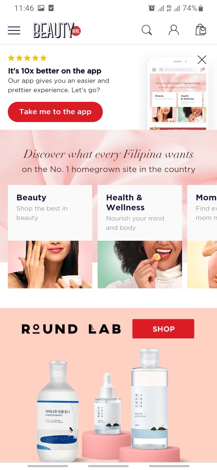
See how BeautyMNL keeps the popup small and places it on their top page, so it doesn’t block their homepage:
However, if you insist on creating a big popup that covers most of the screen, it’s always better to make sure to make it easy for a user to close out, by making the X (close button) large enough for them.
#3. Plan For Unique and Fantastic Design
Mobile users are always on the go. They don’t have enough time for mediocre, generic-looking popups. So, don’t blame them if they close your popups just like a reflex.
However, you can remedy this simply by choosing a catchy, impressive design.
Since mobile popups are smaller than the desktop counterparts, try to choose a visible background to catch the user’s attention.
Also, you need to stick to the screen layout to keep user-friendliness in mind. Meanwhile, fix any intrusive overlays and make sure that users have a great browsing experience to fill the form and stay longer on your website.
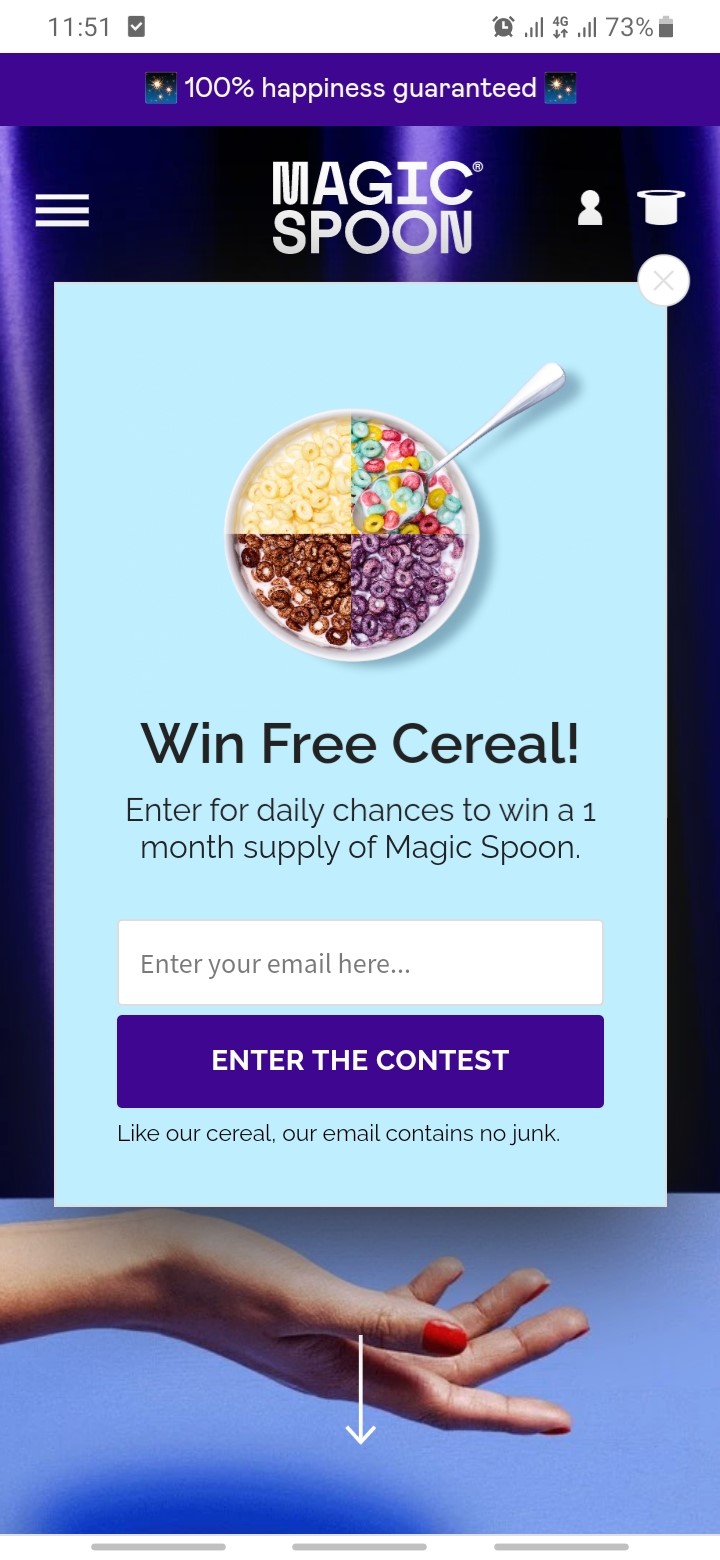
The example from Magic Spoon below can get you more insights on how to create well-crafted, compelling mobile popup — from the background color and minimalistic image.
#4. Pay Attention to Call-to-Action Button
Considering that mobile popups are much smaller than the desktop ones, you need to make your call-to-action (CTA) clear. If you confuse the users with vague CTAs, they obviously skip the popups without converting.
Besides the clear and obvious copy, you also need to make the CTA button stand out. Here, you can try to pick a colorful color to make it even more visible to click.
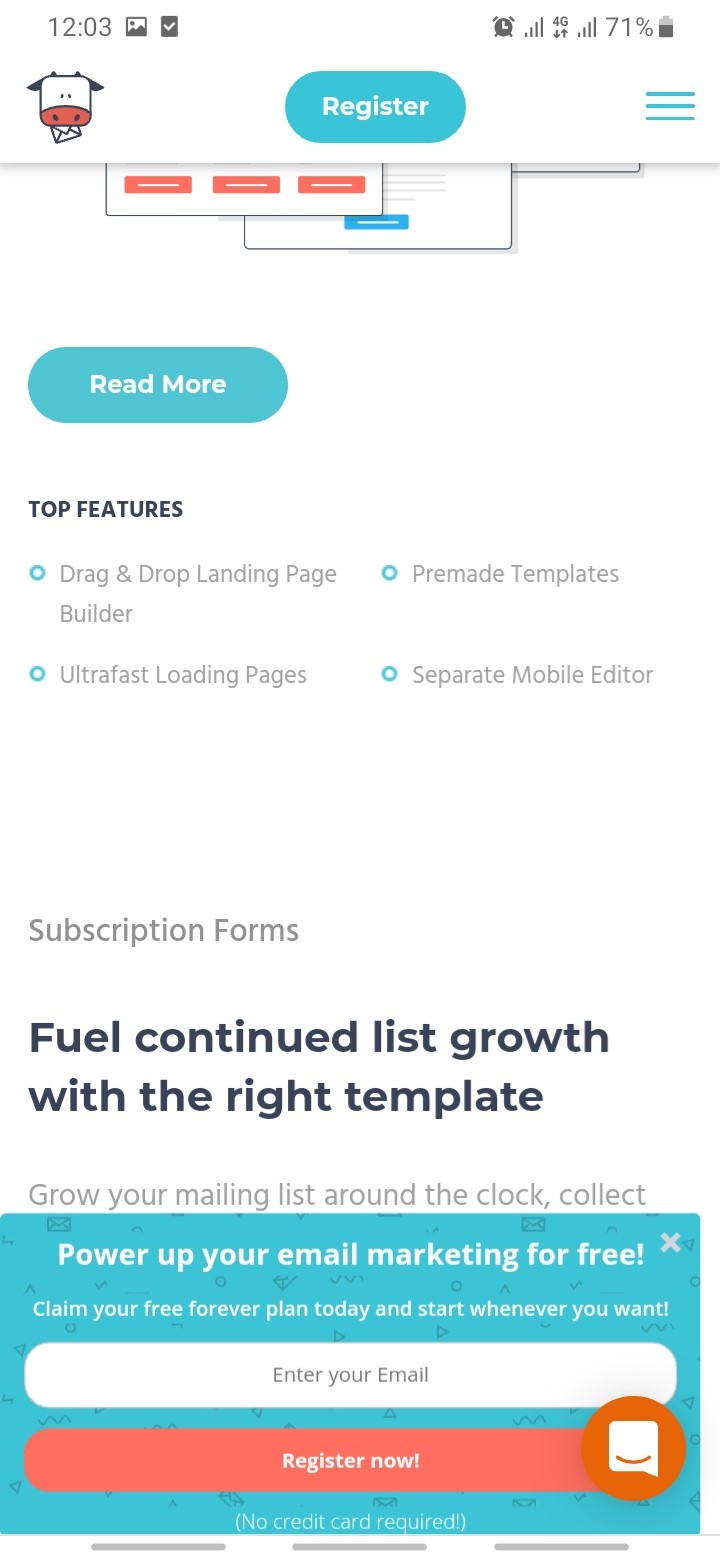
MooSend shows you how you create an obvious and clear CTA by using contrast color:
#5. Segmentation Is Key
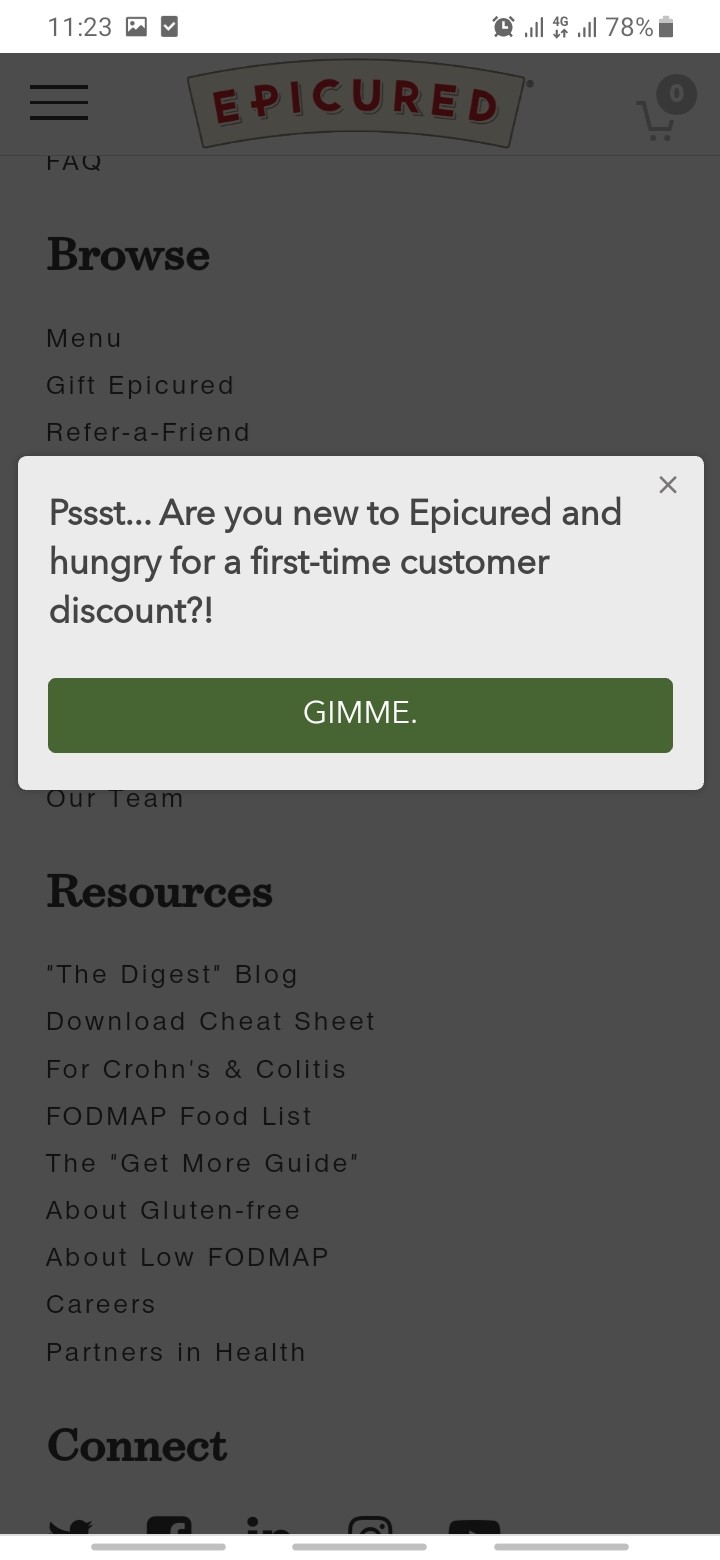
The more you personalize your mobile popups, the more users can relate, and the higher chances you have to get them signed up. In this case, you need to tailor the popup’s experience to your different users or visitors.
You can get personal by creating different personalized popups for audiences like new visitors, loyal customers, located in a certain geographic area, and more.
Here’s an example from Epicured that offer their first-time customer a promising discount:
#6. Consider Gamification
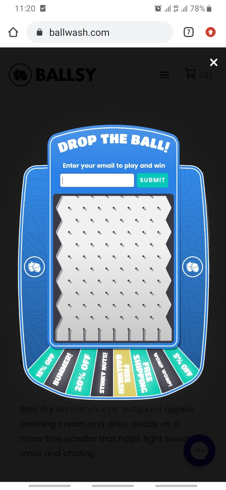
One of the best ways to spice up your mobile popups game is adapting gamification. It’s a non-boring way to create an engaging user experience and tempt more users to fill out the form to convert, beyond asking for their email address.
Through a game, you can also display your offer in dynamic and unique ways. This way, it creates a memorable experience for users.
Some common highly-performing gamification concepts are used in mobile pop ups templates
, such as spin the wheel, pick the gift, scratch and win, and more.
Ballsy uses ball drop game to give the users prize based on their luck after they submit their email address:
Wrapping Up: Over to You
With the large numbers of mobile internet users out there, creating well-designed, well thought out mobile-friendly popups can supplement your overall marketing campaigns and generate new, exciting content for a site visitor. What’s more, it can also help you build a solid email list and improve your Google ranking.
Of course, jumping into the mobile popups bandwagon can be daunting, especially when there’s already misperception and possible penalty about this hidden yet powerful marketing tool. That being said, you can make sure yours falls on the right side of mobile popup campaigns by implementing some of the best practices above.
Author

Andre Oentoro is the founder of Breadnbeyond, an award-winning explainer video company. He helps businesses increase conversion rates, close more sales, and get positive ROI from explainer videos (in that order).
Twitter: @breadnbeyond
Email: andre@breadnbeyond.com
