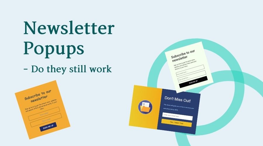
Do newsletter popups still work, and should you use them?
People hate pop-ups…
A study conducted in 2016 indicated that almost 75% of all respondents have described popups they encountered online as annoying to some extent. Safe to say that nowadays, 5 years later, Internet users hate pop-ups, and Google hates them as well.
…but they work.
Still, there are objective benefits to using newsletter pop-ups. According to the Blog Marketing Academy, pop-up ads have demonstrated a 2% click-through rate – which is more than the CTR of any other ads in the same experiment. There are numerous other case studies that illustrate the power of pop-ups.
The audience you build with pop-ups is often slightly more responsive – since they’ve already trusted you enough to input their e-mail into the pop-up. Moreover, the newsletter subscribers you get via pop-ups can be easily segmented into groups based on their interests – just sort them by the pages where they saw the pop-up.
Newsletter pop-ups best practices
In order for your newsletter pop-up to work you need to synchronize the timing, the style, and the value. These three essential parts will determine how your readers will feel about your pop-up. If one of the three is lacking you will be getting sub-par results, but if all three are off the mark – you may be losing your audience.
Not every business is getting all three of these right from the start – but it comes with experience and data. Let’s take a detailed look at how timing, style, and offer work together in boosting your newsletter signup rates.
Getting the timing right
The pop-ups that block the content immediately annoy visitors the most. There are very few scenarios when an immediate newsletter signup pop-up can be justified. Newbie marketers often insist on displaying pop-ups fast – and risk increasing their bounce rate as a result.
As a result, the first rule of timing for pop-ups – give your visitor some time on-site before you ask for an email.
Most of the time your pop-ups can be timed by
Time on site
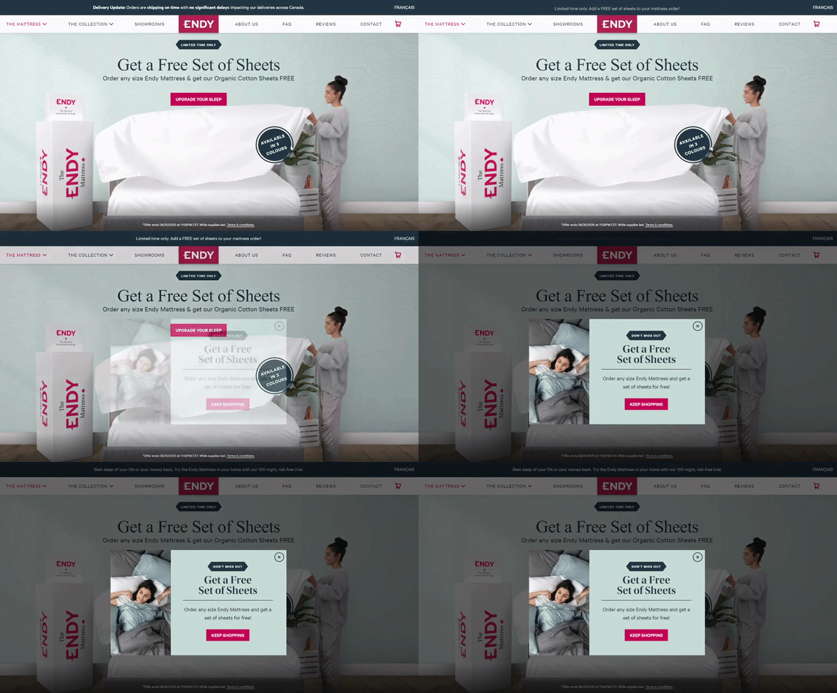
This is the classic way of triggering a pop-up – the user sees it after spending X seconds on site.
You can play around with this setting – if you set the pop-up to be displayed later than the average time on site then only the dedicated readers will see it. That may mean that the email list you build will be very responsive.
Scroll depth
You can set up your newsletter pop-up to be displayed when the user scrolls down past a certain part of your page. The logic here is that the readers find the content appealing and read it (or at least skim through it) while scrolling down, which means they will be less annoyed by an email submission request.
Exit intent
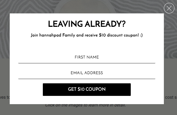
This method of timing pop-ups is by far the most effective one in 2021. Exit intent pop-ups appear when the visitors display signs that they are about to leave the page.

On desktop, exit intent is mostly based on cursor movement towards the “back” or “close” buttons in the browser.
On mobile, exit intent is mostly registered if the visitor is scrolling up (since most of the phones display the address bar when you scroll up).
No matter how you determine exit intent, pop-ups tied to it are extremely effective. Exit-intent pop-ups help reduce shopping cart abandonment on e-commerce stores, but they will work equally well for newsletter signups too.
Getting the style right
When you design your newsletter signup pop-up, pay attention to the branding, tone, and amount of creativity invested.
Branding your pop-up
Your visual popup design needs to be consistent. This helps ease some of the tension that any pop-up inevitably causes.
Does your pop-up look like the brand your visitors are used to?
Does it have familiar elements, like the picture of the founder?
The more familiar your pop-up looks, the more comfortable it feels.

Tone of voice
The call to action, popup headline, and any other text on the newsletter pop-up need to be consistent with the writing on your website.
It’s always a good idea to have custom text on newsletter pop-ups that corresponds to the page it’s displayed on. Custom calls to action always work better than the generic ones like “sign up”.
NewsCreativity
If you’re going to interrupt your visitors’ time on your site with a message, you better have an original message expressed creatively.
Getting the value right
This one is more intuitive, a matter of tact and taste. Take a look at the situation through your visitor’s eyes – what’s in it for them? What is their incentive to give you their email address?
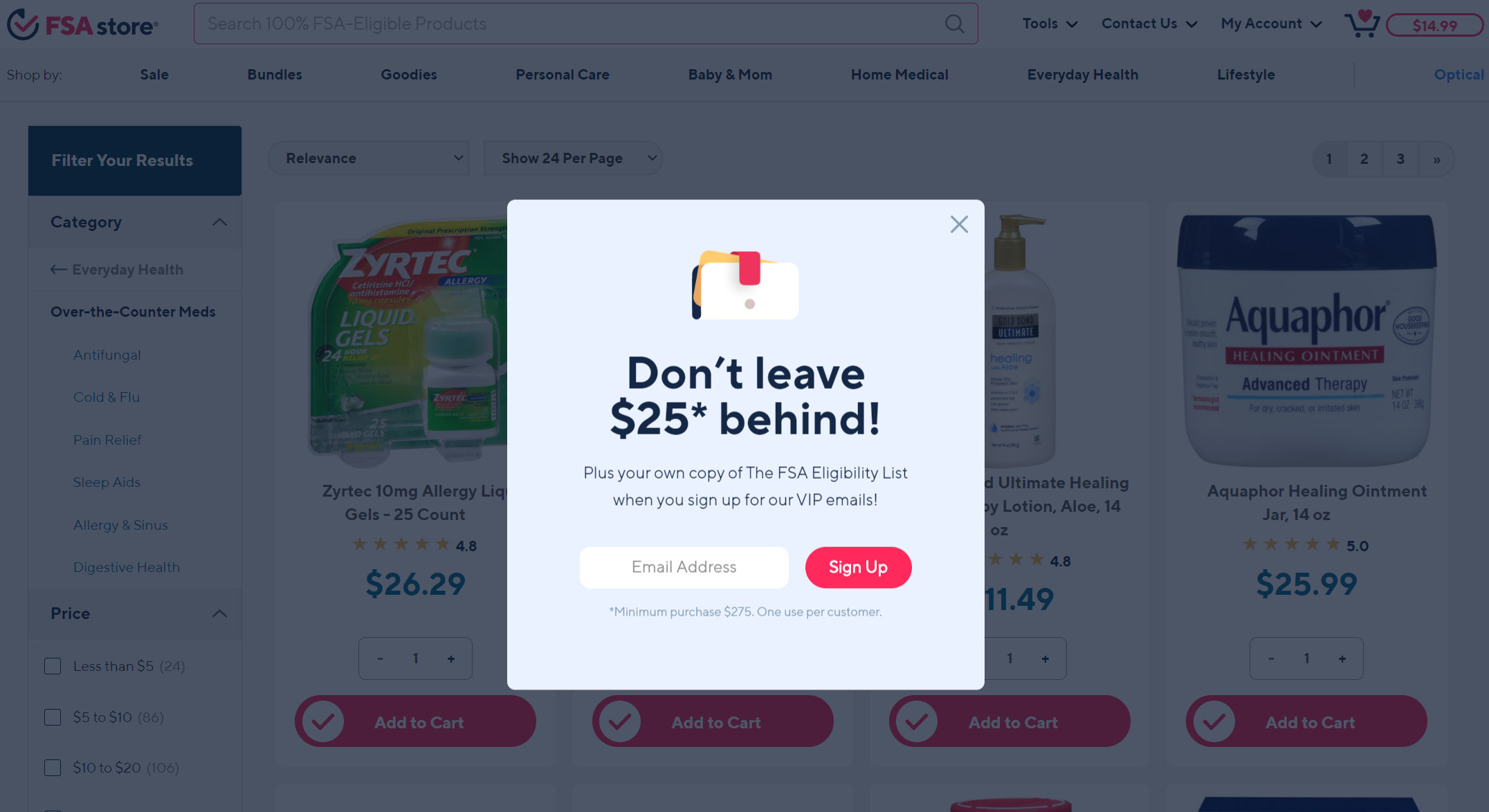
“Lead magnets” work well for this – those are usually downloadable assets that the reader gets after providing their email address. Those can be checklists, industry reports, templates, printable memos, and anything else that makes sense in your niche.

What a lead magnet does with newsletter popups is it sweetens the deal. Instead of just giving you their email address, people are immediately getting something as a bonus.
Check out this list of tips for effective exit popups we’ve put together if you’re interested in further ways to boost the value of your popup offer.
