5 Reasons The Promo Pop Ups Have Not Worked For Your Site
Promo pop-ups can do wonders for your business website or blog but only when they work. For example, the subscription rate and leads of BitNinja increased tremendously by 114 percent after using popup effectively. If promo popups are used effectively, they can make 20 to 70 percent of visitors give their contact information.
The real question is –
Do promo pop-ups always work for your website or blog?
The answer is –
No.
Why?
Because visitors feel uncomfortable with promional popups. According to statistics, 45% of users of AdBlock do not want to see promotions or ads and want to remove as many ads as possible from the sites. This means you have to be very careful when designing and putting promo popups to enjoy their benefits.
Now, if you are worried about a promo popup not working for your website, you need to know the reasons behind it. Let Qualzz tell you the five reasons why promo pop-ups don’t work for your site.
Wasting Visitors’ Time By Requesting Excessive Information
Have you ever thought about why people prefer online shopping?
To save their time!
And if that is not happening, it becomes a shame for a website. Promo pop-ups created with too many field areas to fill are annoying for visitors as they do not want to spend their quality time filling up long forms.
This is one of the main reasons why promo popups don’t work if they waste visitors’ time; for instance, see in the example below:
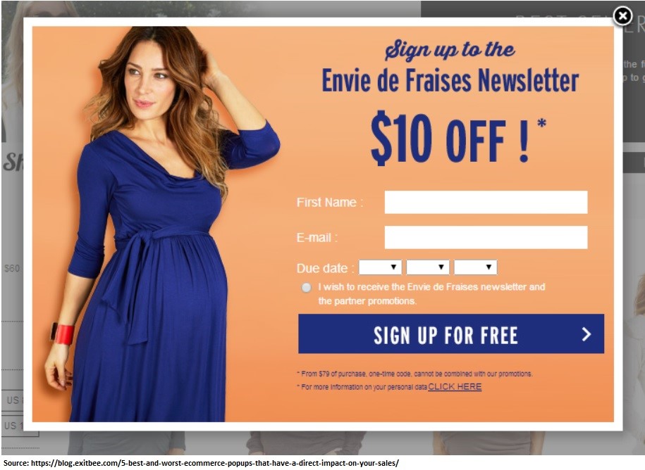
Too many fields that require multiple clicks are given for online shoppers to fill, which may annoy them and close the pop-up without any action after a single glance.
Your business nature determines the type of data you want from your visitors. However, the general rule of the thumb is less is always better. Typically the best practice that can make any promo pop up works is to ask for only email address rather than gender, age, or first name.
Untimely Display Of Promo Pop-Ups
Promo popups are ineffective because they are not displayed at the right time. Many people think that popups need to be displayed when someone opens a website.
Well, that is wrong, my friend.
You should never display the popup right when someone comes to your website. Wait for visitors to be on the website or blog for at least 20-30 seconds or right before they leave; that is the best time to show promo pop-ups as the last dish effort to get their name or email.
Here is an example, Boom launched its promo pop up offering a free e-book to its visitors showing less engagement when they are about to leave the page:
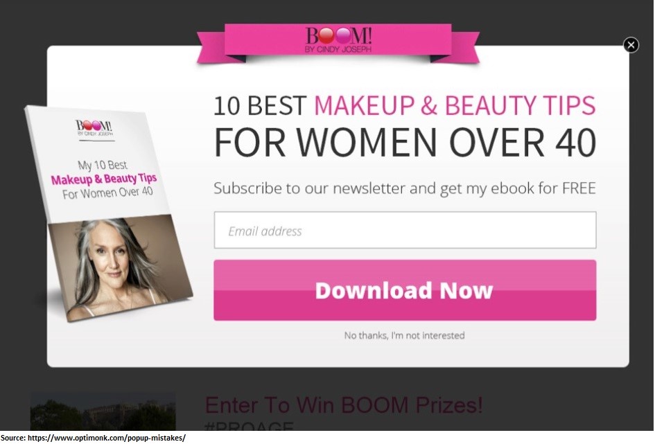
This timely display of promo pop up asking only for email made them increase their revenue by eighteen percent in a month. So, yes, promo popups still work when you don’t show them when someone first visits your site.
Promo Pop-Ups Are Ineffective When They Add No Value
When creating a promo popup, you cannot just create something that says subscribe to a newsletter or buy now. You have to do something that gives value.
Someone is leaving your website because they didn’t get what they are looking for. So if you are not going to give them something really valuable, you are not going to get them to convert.
If you are an eCommerce company, a 10 percent off coupon or free shipping offer can add value.
For example, see in the image below, ZooShoo, which is an online retailer website; upon observing an increase in the ratio of the abandoning visitors go through the website without purchasing anything, decided to use a coupon giveaway in promo pop up.
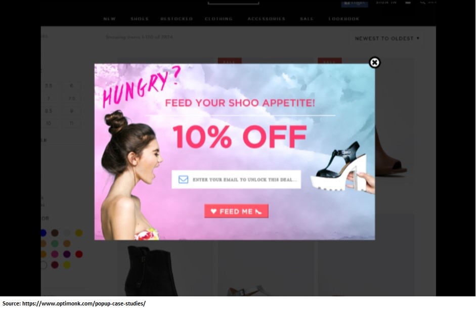
You will get a coupon for a 10 percent price cut on your next buy if you signed up to their email list. This promo popup move increased the revenue of ZooShoo by 7.35 percent within two months.
That is something you can do within your promo pop-up to make it effectively work for your website, and don’t forget, keep it short like ZooShoo.
So think about what your visitors want that you are not providing and consider providing that in the promo popup, and you will notice that you will get more sales.
The Way Promo Pop Up Is Displayed
Not presenting your promo right can make it fail. The size is the most crucial factor here as many small pop-ups go unnoticed, especially when their colors are not noticeable. You can opt for promo pop-ups that take up the whole screen or a considerable part of the screen. Promo popups that take up the whole screen tend to do the best as a compelling offer.
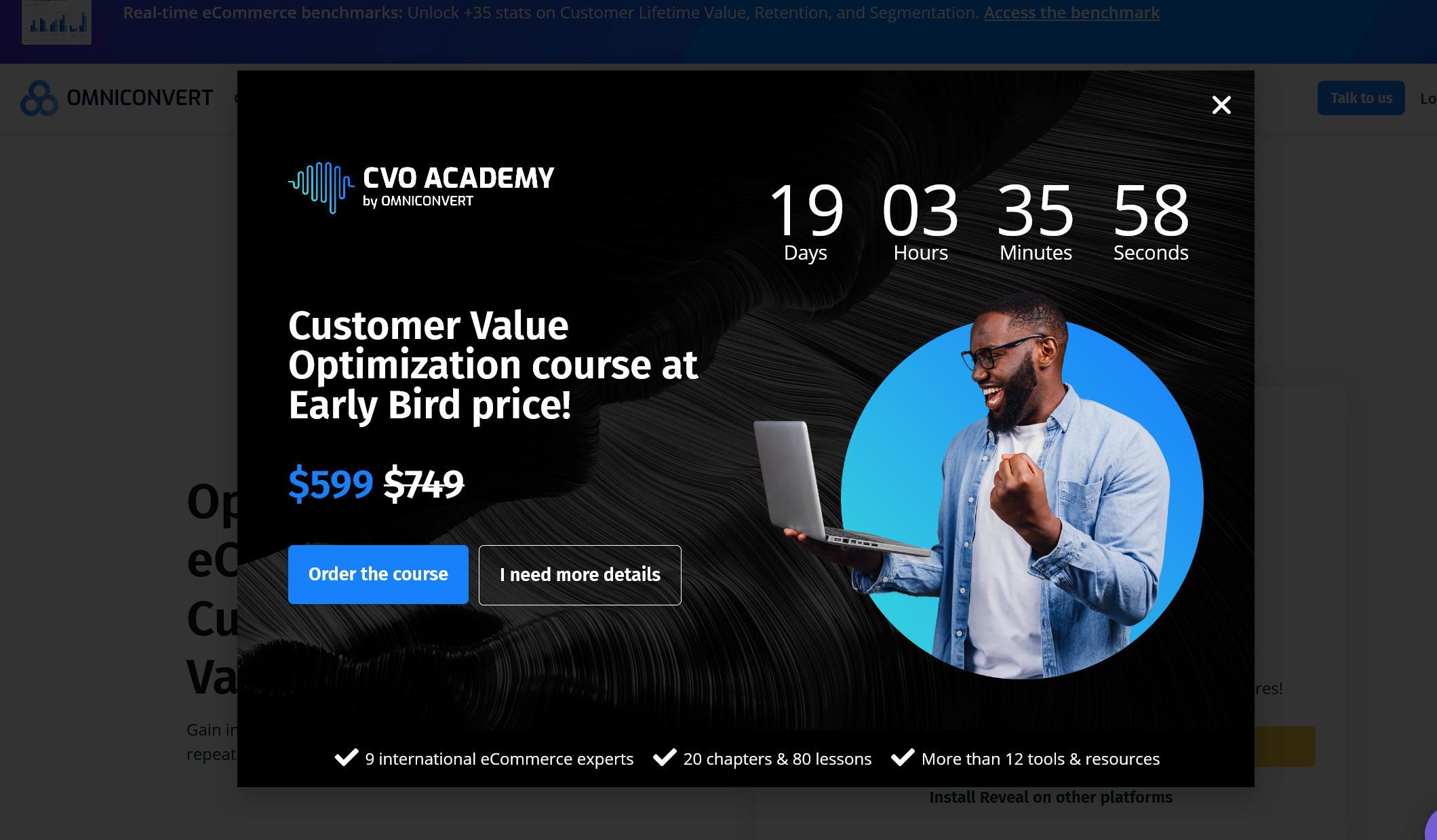
But remember, the timing must be right. Wait it out, let the visitor enjoy your site, make a good impression of it, and then pop up the question grandly.
Trust us; you will get some conversions.
Unfit Promo Pop Up Design With Website Design
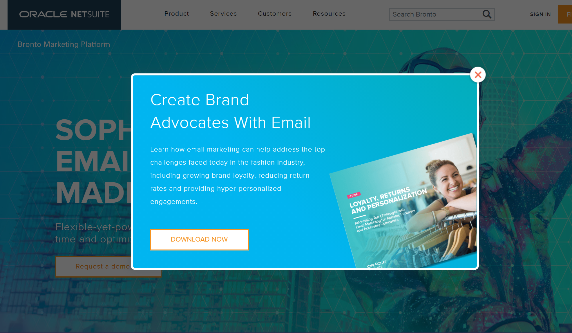
One of the key reasons why your promo popup won’t work for your website is the mismatch between the pop-up design and the style of your website. For this, you require the services of an expert company that can design the promo pop-up to go well with your website style. Here Qualzz offers you quite a wide array of designs to meet your needs by experts in the field, so your pop-ups make the right impression.
The promo pop up of Bronto in the image below is the best example of a suitably designed promo pops up according to their website style:
Concluding Remarks
Promo popups are everywhere on the web. According to the research of Copyblogger, you can instantly boost your email list opt-ins by using an effective popup strategy.
However, you will find many pleasing pop-ups while others will annoy you.
Put briefly; you need to avoid the five mistakes mentioned in this article to make your finely designed promo pop up work for your website.
To develop an excellent promo pop-up strategy that really works for your website, you need a professional promo pop-up designer like Qualzz.
