7 Website Popup Mistakes That Will Kill Conversions
Do you want your website visitors to give their contact details?
You can do so by using website pop-ups and by pop-ups, we mean the good ones.
A popup is a marketing tool developed to grab the attention of website visitors promptly. It contains promotional information and is displayed on the top of your website content. There are quite a good number of different types of pop-ups, such as lightbox pop-ups, newsletter popups, exit-intent popups, and more that appear either while browsing or visiting a web and website respectively.
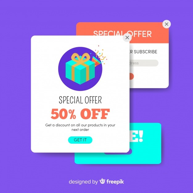
A finely designed pop-up can make 20-70% of visitors give their contact information. If, on one hand, a good pop-up can do miracles, on the other hand, bad website pop-ups can annoy your visitors.
The traditional entry pop-ups with vexing advertisements are gigantic infuriation for users which damages the website. Though there are various website popup mistakes that will kill conversions but here seven most common popup mistakes are explained that you must steer clear of.
Irrelevant Offer on Pop-Ups
Relevant offers at right time always hit the mark!
If you do not understand it, let me clarify it with a simple example. Suppose a visitor is about to buy the item from your website, he is at the end of the buying process and ready to pay for the items in their cart, but suddenly he tries to leave the site. Is it the right time to offer an ebook for free?
Let’s take another case, suppose a visitor is a regular reader of your blog but has never shown any inclination of buying anything. At this point in time do you think you should offer a coupon when he is about to leave?
Of course not!
It is better if you place sales, promotional or discount offers in the earlier stages instead of placing one at the last moment when visitors are ready to leave.
One of the most commonly made mistakes is displaying pop-ups on irrelevant pages of sale websites, for instance, placing the promotional offer of free tablet cases on all pages of products is absolutely vain. This pop-up should only be displayed on pages associated with tablets.
If you want to increase your sales, visitors’ engagement on your website, or the number of subscriptions then it can be done by using an exit-intent pop-up. Exit-intent pop-ups are particularly designed to trigger visitors when they are about to leave your website by displaying exciting offers.

High Demand Of Asking Excessive Information From Visitors Using Pop-Ups
If you think you can convert your visitors into your customers by asking too much lead information on pop-ups, you are seriously mistaken. You actually stop your visitors from converting by doing so as it is quite invasive.
So, you should never make this mistake and only ask for little information, such as email ID.
Do you want to learn more about your visitors and want to know the right way to ask for additional information?
Of course, you want to know more information about your visitors and for this, you have to include more questions to your website pop-up. However, the research shows that conversions go down considerably when pop-ups contain lengthy input forms.
Using click pop-ups for more information is the best way to convert visitors. This boosts popup conversions because visitors have already clicked your banner displaying your offer. You can add two and four form fields on a click popup as it is less menacing.
Making A Bad Offer In The Pop-Up
Making a bad offer is the worst mistake you do in your website pop-up that will surely kill the conversion. These bad offers not only kill the conversion rate but also fail badly to persuade visitors for subscriptions.
No matter how beautifully your pop-up is designed, if the offer it displays is not good, it will not excite visitors at all.
Now you must be thinking about how to avoid bad offers.
The simple answer is to keep it distinctive, pertinent, and electrifying for visitors. One thing you should never do is the repetition of the same offer in pop-ups at different places on your website.
This is because if the visitor did not find it attractive at one place, he will not like it again when it appears at some other place on your website. Instead, repetition will frustrate your visitors.
You can avoid a bad offer by concentrating specifically on only making a single offer instead of making multiple offers in a pop-up.
No Synchronization Between the Pop-Up Template Design And The Style Of Website
One big mistake you do is the designing of a pop-up without considering the style of the website; resultantly it kills the conversion by distracting visitors.
What should you do to design the pop-up that goes well with your website style? For this, you should get the services of the pop-up developer that offers you free trial opportunities such as Qualzz. This feature will let you see if the pop-up template design fits the website style suitably or not.
A well-designed pop-up perks up the user experience and improves the conversion rate. However, if the pop-up is not designed in a user-friendly way, it can severely annoy the visitors.
For this, the close button should be as clear as the moon and as swift as a bullet, so that visitors do not have to waste time in reading and closing the pop-ups.
The best pop-up that works efficiently is the one that is simple and easy to use and is developed by using a minimalist approach.

Bad Or No Targeting
Bad or no targeting is one of the key reasons behind failed marketing campaigns. The same rule applies to website pop-up that targets either wrong or no audience/visitors.
Your website is visited by different kinds of visitors, such as first-time, existing, and returning. A bad pop-up is developed without considering the difference between different visitors’ types.
- For instance, promoting your new arrival items to first-time visitors is useless but useful for returning visitors. Likewise, giveaway pop-ups are effective if they target first-time visitors.
- Discount pop-ups should only be for those visitors who qualify for it because displaying them to all visitors does not only frustrate existing visitors but also make them leave your website.
- One of the most common mistakes the websites do is to offer newsletters repeatedly to visitors irrespective of the fact whether they are visiting your website for the first time or not. Newsletter pop-ups should only be for returning visitors instead of first-time visitors.
You can avoid badly targeted pop-ups by using popup templates for different kinds of visitors. The targeted pop-ups accelerate the conversion rate and keep visitors happy and satisfied.
Teaser of Your Pop-Up
You frustrate your visitors when your website pop-up appears suddenly, especially on the mobile screens. The visitors close it to visit the website but when interested visitors close it in order to visit your website, many are unable to reach the offer as not everyone is familiar with every part of your website.
You can correct this mistake by developing a quick teaser of your pop-up, which works as a preview to your pop-up. The interested visitors click on your pop-up after seeing its teaser.
Teaser instigates the visitors by giving a glimpse of your pop-up and thus improves the popup conversion rate significantly.
Game-Based Pop-Ups
The visitors’ frustration reaches its height with website pop-ups based on games, such as spinning the wheel kind of pop-ups badly annoy your visitors instead of persuading them.
This kind of pop-up is considered deceptive and spam by users and that is the reason why they instantly close them when they appear. Game-based pop-ups are intricate and disappoint visitors easily.
Instead, design your pop-up in a way that looks part of your website instead of something unrelated to your website.
Final Words
If you want to maximize the conversion rate, you have to avoid these common but crucial pop-up mistakes. These mistakes do not only frustrate visitors but also instigate them to close these without even reading the content.
You can avoid these mistakes by designing website pop-ups by using the approach of minimal, which means the use of less but relevant, captivating, and concise content.
Put briefly, getting the professional services of trustworthy and experienced pop-up developers in order to grab the attention of your visitors by displaying appropriate offers at right time is an excellent approach. Just don’t forget that a free trial offer is the best way to expand your pop-up tools.