What Is A Lightbox And How To Use It To Maximize Sales?
You must have noticed a popup suddenly appear on your computer screen while browsing around the site. It definitely excites you if it offers a discount. Popups can either worsen users’ experience or boost it if appropriately designed and launched timely.
Popups are deemed as one of the most powerful tools to increase the site’s conversion rate. The study of sumo reported that the typical rate of conversion for all popups is 3.09 percent. The conversion rate of Medstar Media showed immense growth of 500 percent after using exit-intent lightbox popups.
Let’s first straight dive into the most frequently searched questions on the web.
What Is A Light Box On A Website?
It is an overlay window that suddenly emerges on your screen when you are visiting a website. This sudden emergence of a lightbox window usually blocks the content you are reading or blurs the background image.
If you want to access the page or site content, you have to take certain actions such as exit, click or fill the provided form. Typically, they appear in the center of the webpage, but they can be launched on any part of the screen.
You can choose from a wide range of different types of lightbox pop up for your site, such as discount lightbox, upsell lightbox, login lightbox, content offer Lightbox, and more.
Marketers use it according to the purpose they want to fulfill.
Are they effective?
The effectiveness of the lightbox window depends on various reasons. Website owners use them to develop their subscribers’ base; for instance, GONG uses lightboxes to persuade visitors to subscribe to the list of an email newsletter.
However, some companies use them to give discount offers.
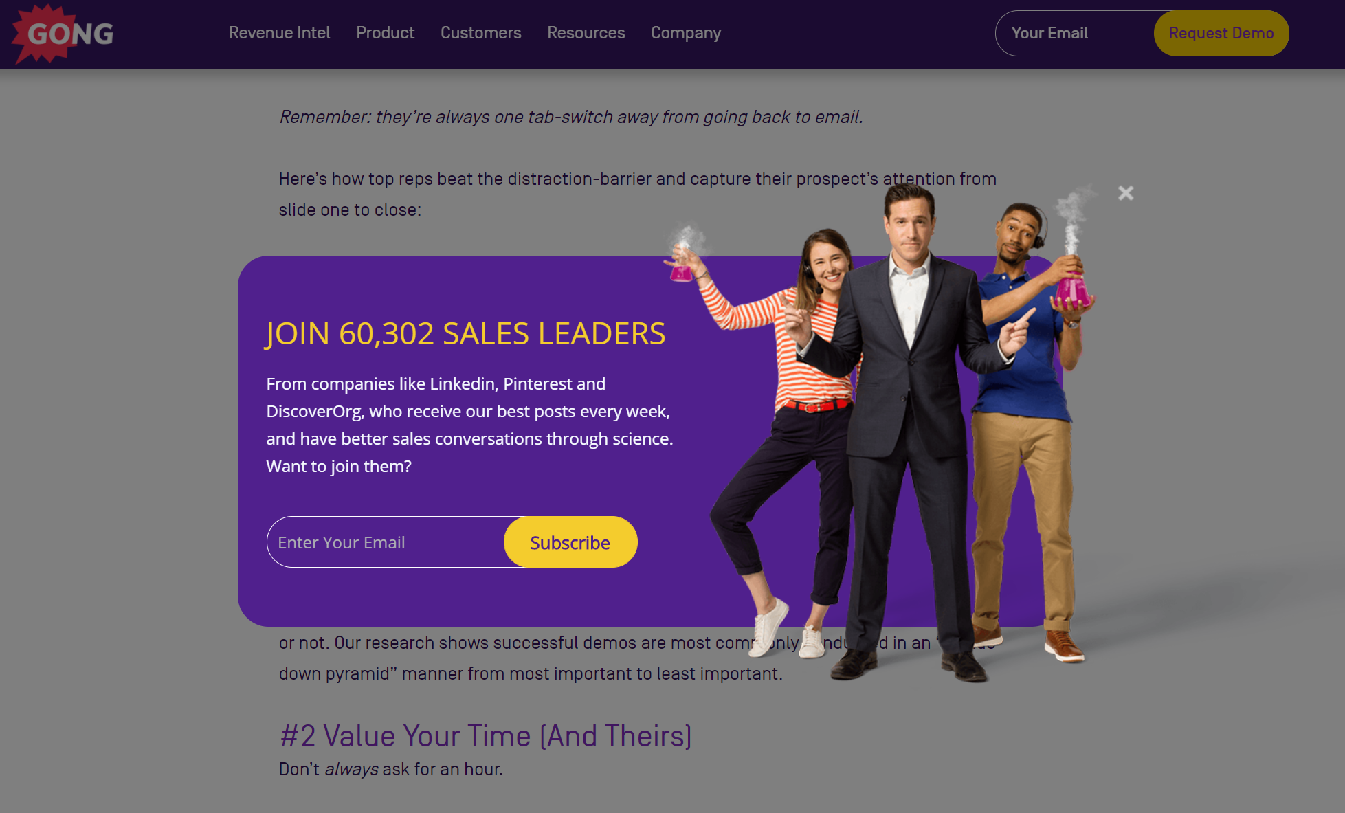
The visitors are offered an excellent inducement that will likely push the visitor to sign up and get their exclusive concession code.
Lightbox pop-ups also help increase the social media following of your site.
Why? Well, it reaches your targeted audience by attracting and retaining them by advertising your products and discounts.
If you want to increase your email list, no other way can be as useful as the lightbox pop-up as it has been proven the most effective tool to gather emails from visitors.
Tips To Use Lightbox Pop Up For Sales Maximization
Let’s check out some useful tips to make a lightbox popup maximize your sales.
§ Use Them Appropriately
Lightbox popups allow you to capture your audience’s interest and concentrate on your message.
Your site visitors have two options upon the launch of the lightbox popup: either to exit by clicking the cross icon or to take action mentioned within the popup window. The visitors cannot ignore your popup if it contains a powerful message. However, the launch of excessive popups can ruin the user experience.
There are various situations in which you can use lightbox popups:
- Crucial announcement sharing, such as shipment delays, etc.,
- Discount promotions
- For terms and condition confirmation
A lightbox popup is appropriate on mobile devices only when used cautiously because Google can penalize you for making content inaccessible. The best time to display a lightbox pop on a mobile device is to display it after the appearance of the first page.
§ Precise Design Preparation
The effectiveness of a lightbox popup is greatly dependent on the way you design it. In order to create a precise design, you need to select the Lightbox popup overlay very wisely by using images and an appropriate color scheme. The selection of lightbox overlay is essential because it blots out the rest of the website.
If you keep a lightbox overlay transparent, it will be your best decision because, in this way, your visitors will see the page in the background.
The design of your lightbox popups is incomplete without the type of content you select. It is important as it disrupts your visitors while they are navigating around. Keep the content of the popup short, relevant, and powerful using bold font and colors.
For example, see in the image below:
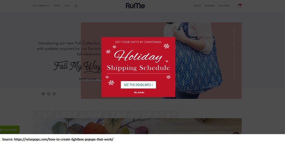
MyRume has created a lightbox pop up in which it shares its shipment deadlines detail in the Christmas season by selecting impactful and short sentences.
The selection of the color and opacity of your lightbox popup is also one of the trickiest factors, as, with an extremely dark or too light selection of color and opacity, the visitors will not be able to see which page they are on.
§ The Placement Of Lightbox Pop Up
If you are unable to understand where, when, and how to use lightbox pop up, it’s about time to learn it. The majority of the lightbox pop-ups are usually in the center of the screen. However, you will find a variety of styles in numerous sites as there is no hard and fast rule for the placement.
For instance, see in the image below:
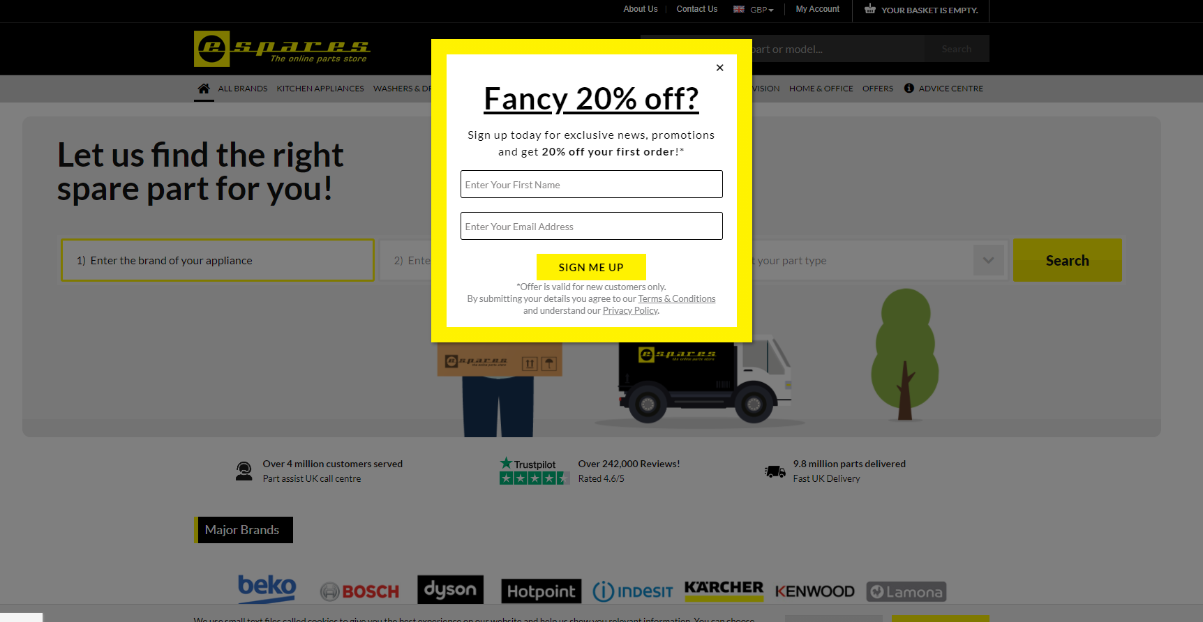
The company has used a lightbox and displayed it on the top middle page in the HERO section of the webpage. You will find plenty of options to choose from for your site.
But if you are still confused regarding which style to use, you should test different ones to see which style goes best with your site or simply hire experts like Qualzz to design appropriate lightbox popups for your website.
§ The Closing Option For Lightbox Pop Up
As a lightbox pop up emerges interrupting the users’ navigation, it should be designed in an uncomplicated way, so that visitors’ experience does not get harmed.
Some lightbox popups are created by keeping the closing option very big, while others are developed by keeping it quite invisible.
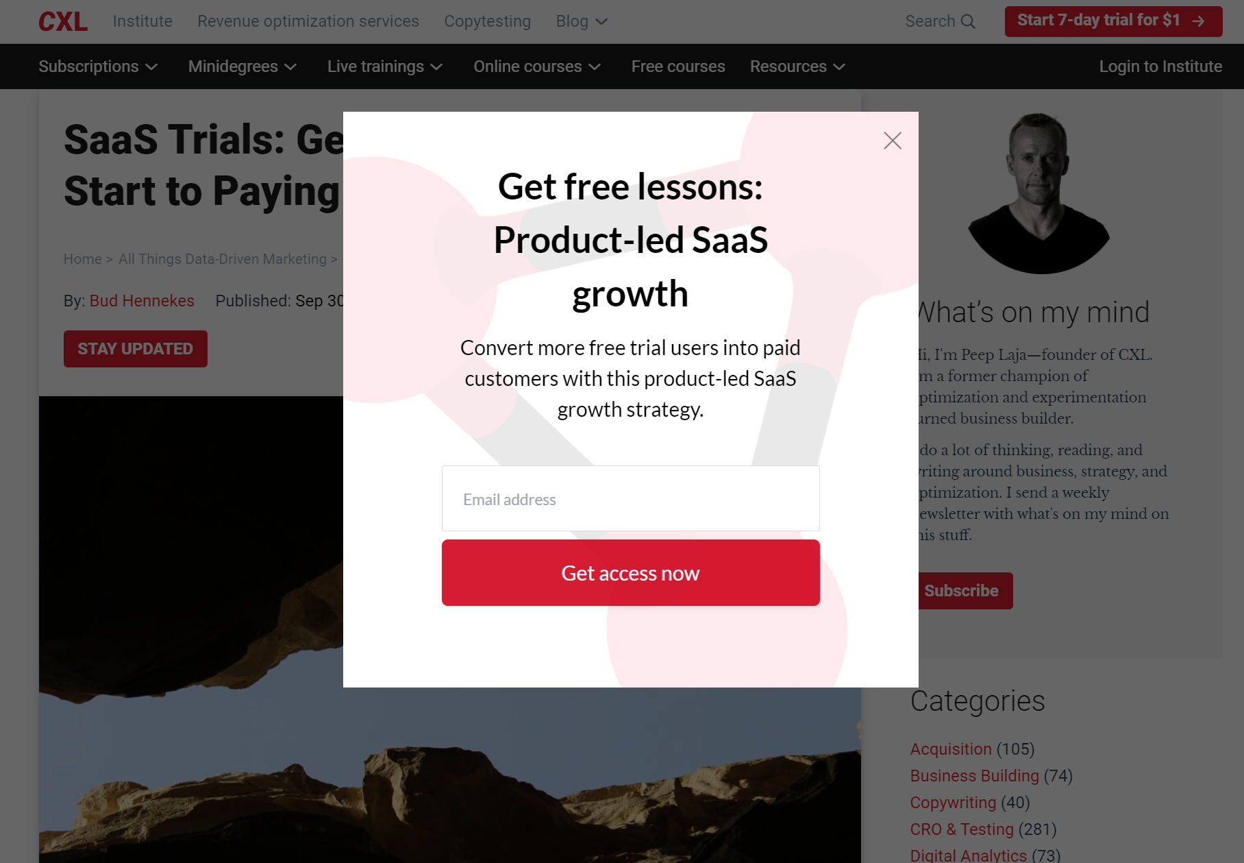
Both types of closing options are used inappropriately because a too visible closing option is risky, while a too invisible option is annoying. The formula that works well is to keep your closing option moderately visible so that visitors can easily exit the website if they take action or not.
For example, the closing option in the image below is appropriately selected:
§ Timing Of Displaying Lightbox Pop Up
One of the biggest mistakes often done by marketers is the launching time of lightbox pop up. The most suitable time to launch a lightbox pop up is when the visitor is about to leave the page. If you launch it right after visitors open your site, it might frustrate visitors, making them leave your site.
§ Offer Value
Lightbox pop up that does not offer any value to visitors is vain.
You must be thinking, why?
Here is its simple answer.
You are stopping visitors in the middle of their navigation which might harm their emotions. There is only one way you can avoid emotional harm to your visitors, which is by offering them value through a lightbox pop up. For example, see in the image below:
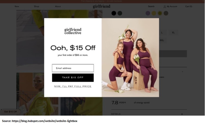
The company is showcasing a big discount offer of $ 15 to attract customers.
Closing Words
A lightbox popup is one of the most useful tools used by marketers, but they only work when used appropriately and wisely. On the other hand, if not selected cautiously and carefully, it will disturb the user experience and affect your profit-making as well.
But by following the tips we shared in this article, you can create an impactful lightbox pop up, which helps you increase visitors’ retention and maximize sales.
So what are you waiting for? Develop an impressive lightbox popup and enjoy higher sales!
