7 Of The Most Effective Mailchimp Pop-Ups Examples
How would you like to grow your email list fast using the MailChimp popup on your business website or blog?
According to research, you can boost your subscribers up to 1,375 % by using pop-up forms.
Growing your email list is one of the toughest marketing targets, but it does not remain tough with the selection of the right tool.
Mailchimp popup is a free tool or a popup campaign on your site that assembles new leads and drives them straight to your Mailchimp account. In this way, you can systematize new email addresses into section-wise contact lists. Not to forget, you can also send custom-made email promotions to your visitors.
Now you must be thinking about why you should use it.
You can enjoy many advantages with the MailChimp pop-up, but one of its most incredible benefits is that it can be used by anyone easily. What you need to have is a Mailchimp account, and then you are ready to go with your first pop-up form. Setting up a Mailchimp account is easy and swift.
What requires your most attention is designing eye-catching Mailchimp popups.
7 Most Effective Mailchimp Popup Examples
Let’s hop over to the 7 most effective MailChimp popup examples, which help you create your own MailChimp pop up to grow your email list and turn your visitors into subscribers.
Example 1: Incentives Work
When a customer visits your website, you can display a pop up instantly, for example, in the image below, a popup is displayed to grab customers’ attention with an incentive:
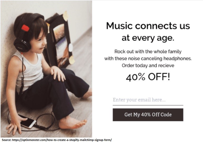
Now, how this image grabs the attention of customers?
It is eye-grabbing because it offers value to customers in the form of 40 % off, which is super hard to resist. You can design a MailChimp discount popup by offering your visitors something valuable, whether it is a promotional deal, discount, or an ebook.
You need to select the offering following your customers’ preferences so that they cannot resist it.
Example 2: Mobile-Friendly Pop-Ups Are A Must
Another excellent example is a mobile version of Magic Spoon, a cereal company.
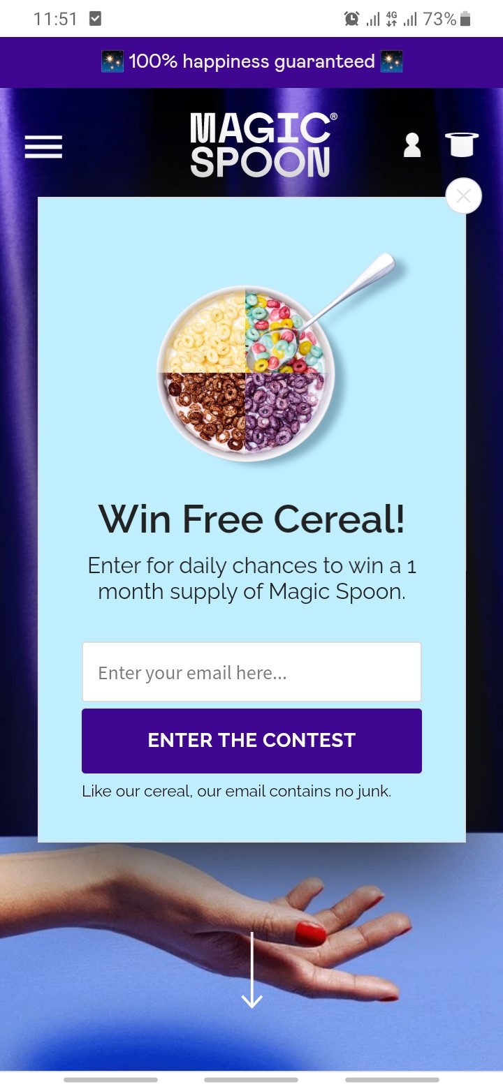
The popup design is super clean and non-intrusive, but what is the big lesson here?
Always create and design two versions of the MailChimp popup. For desktops and tablets, and the other is for mobile phones. Mobiles have become our daily life necessity, and by not creating a mobile version of the MailChimp popup, you will miss a tremendous amount of subscribers and real customers for sure.
Qualzz provides you the flexibility of creating separate designs for desktop and mobile.
Example 3: Popup Design Coherent with Website
Make visitors feel the MailChimp popup as a part of the navigation experience. For example, check this pop up image of Brunomagli below:
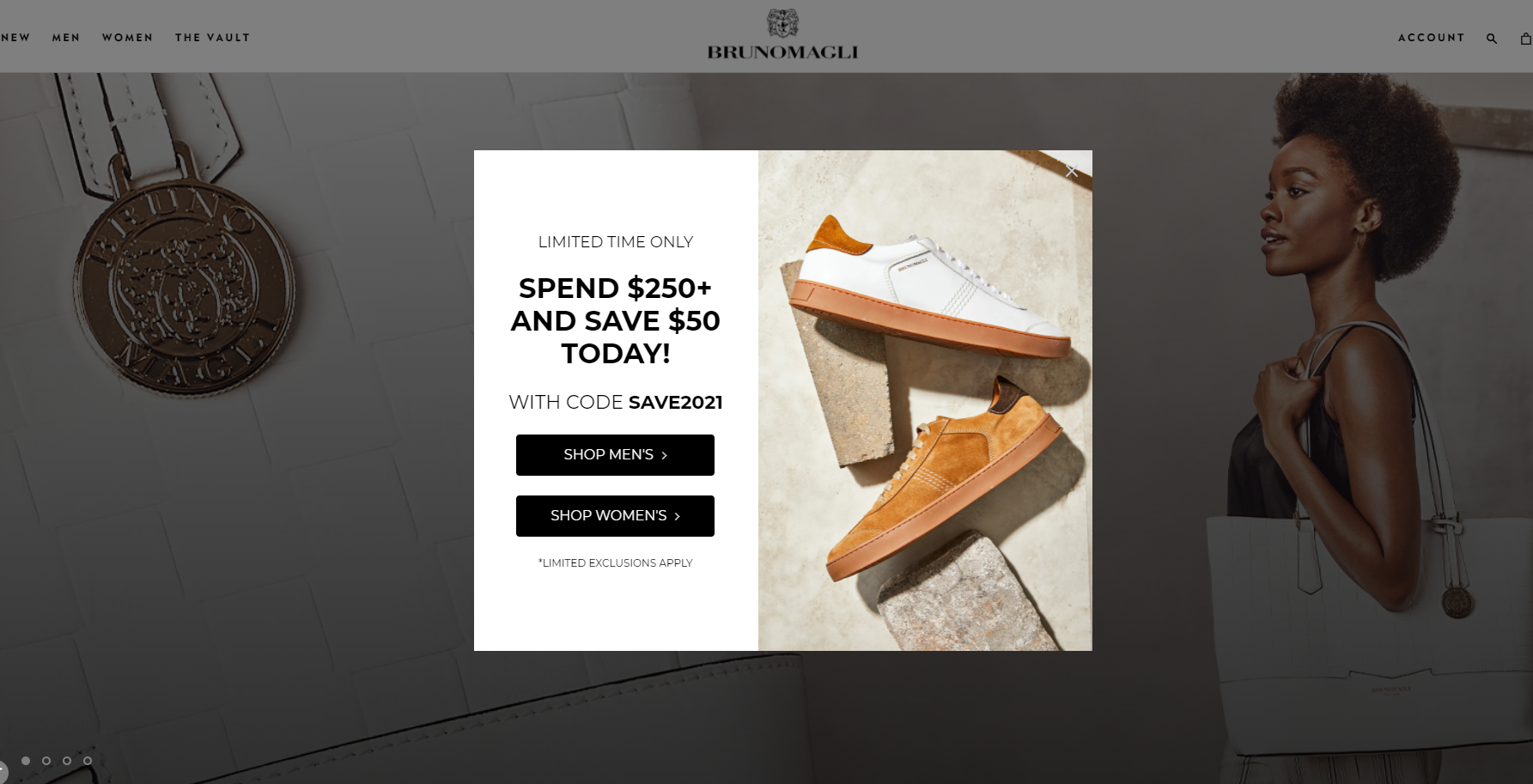
The pop-up design is coherent with the design of the website and the brand style, which makes it a fraction of the navigation experience. For this purpose, MailChimp email templates are of great help; for example, they will help you decide on the color, visual type, and other elements regarding the design of the popup.
Example 4: No Visuals Equal Boring
Create your MailChimp pop-up by using visuals as, according to research, visual marketing strategy is a part of content marketing of 70 % of organizations. Likewise, according to another study, a Virtual Reality product is used by 42.9 million people, while Augmented Reality was used by 68.7 million people across the United States every month in 2019.
In simple words, a popup without visuals is content without a picture which is always boring, and you don’t want that.
Check our example below:
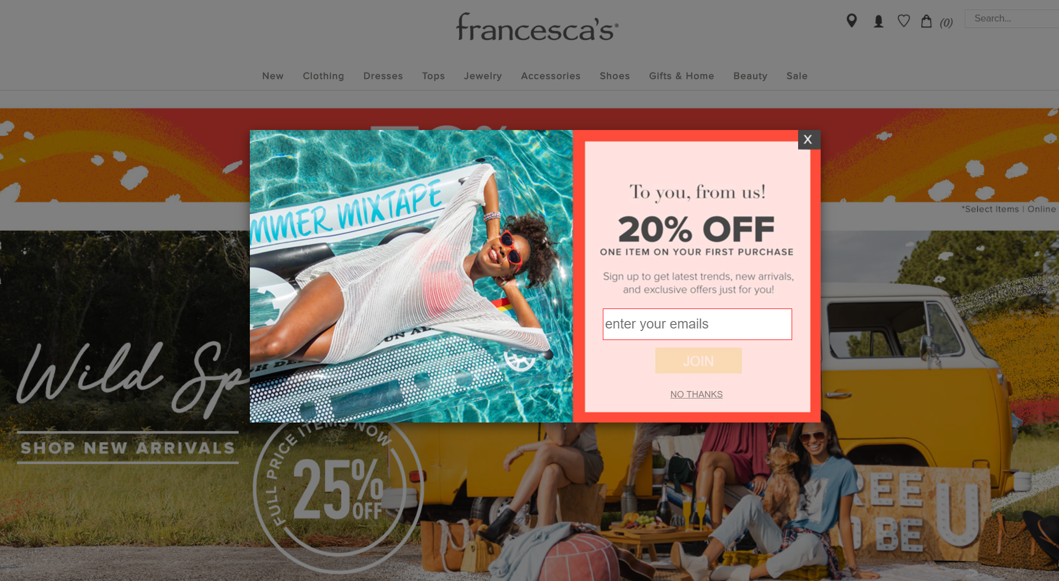
Francesca has created an eye-grabbing pop-up using a compelling visual. Why did we call it eye-grabbing? Well, visuals not only help get visitors’ attention, but they also help make them focus on the message more and better compared to no visual popup.
Example 5: Automation is Good
Do you want to drive your visitors back to your website?
You can do so by using the default ‘MailChimp welcome email option.’ Once you activate the option, it will generate an email for every new subscriber you get, whether the subscriber comes from an opt-in popup or a signup form. It also helps reinforce your branding.
Check the image below:
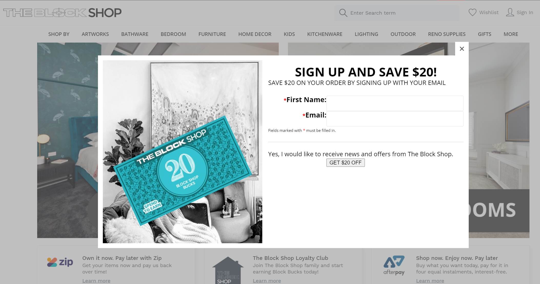
Theblockshop used the default MailChimp welcome email option to display its special offer of a $25 discount with free delivery upon making the purchase of $80.
However, this option is not workable in the case of different segments of subscribers, meaning you require a different welcome email for each.
Example 6: You Need Compelling Headlines
The selection of suitable words and captivating headlines can make your Mailchimp pop up do wonders. For example, Lovercar has created a Mailchimp pop up by using simple but compelling heading in the image below:
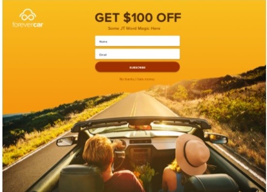
The capturing and simple caption is highlighting the advantages of getting a newsletter subscription. The selection of words is very pertinent and short so that visitors do not get bored of reading long sentences.
This is because wordy statements cannot grab attention instead cause irritation.
Example 7: Offer A Freebie
Visitors always like to know more about the website or the products or services you offer, and what’s better than a freebie to get them to know your business better. For example, Sitepoint uses the Mailchimp popup to offer a freebie to its visitors. See the image below:
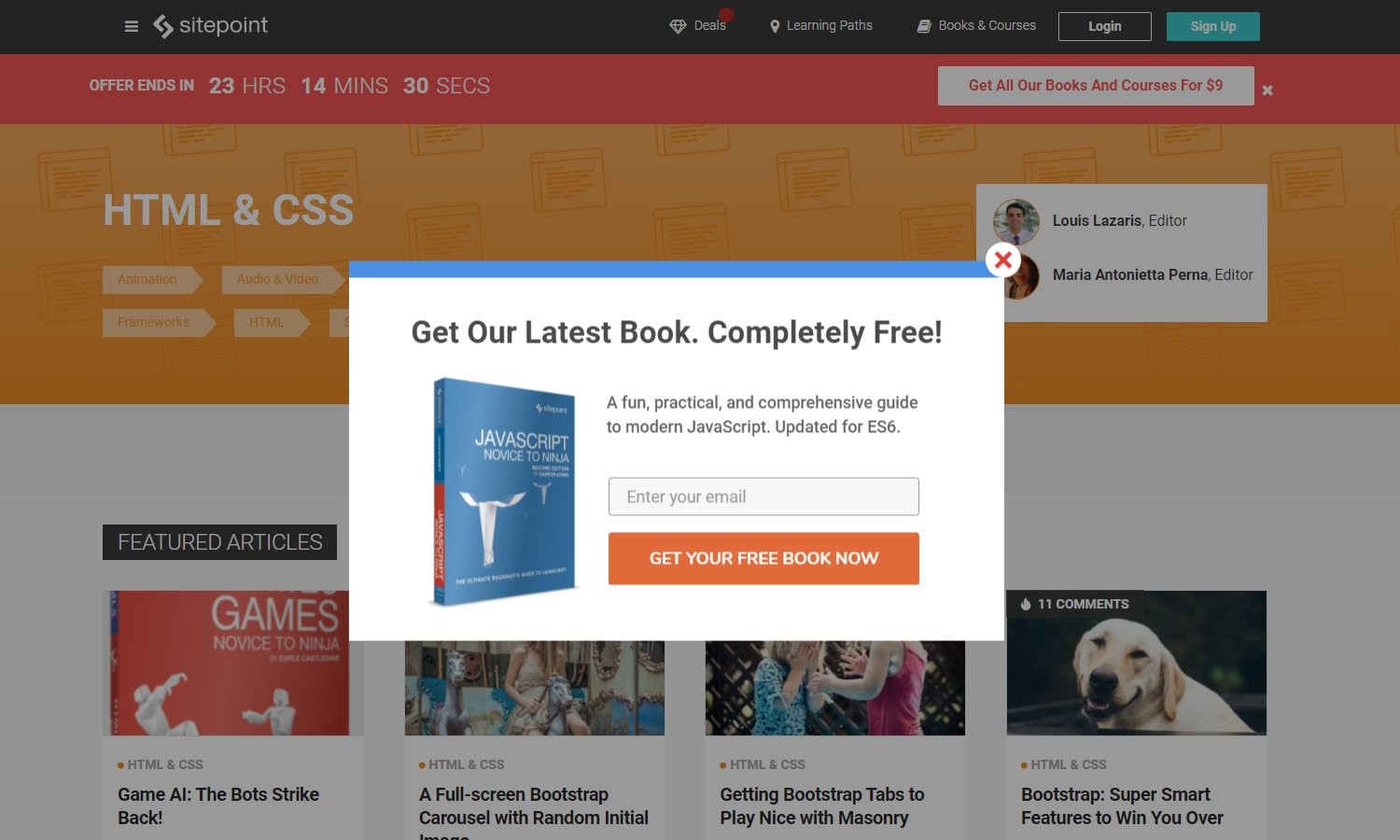
The best thing about this pop up is the short description and its synchronization with brand style, making it feel relatable.
Closing Words
Email is one of the important sources through which customers contact you, as about 61% of customers mentioned email as the way to contact the brands.
Thus, the importance of email marketing for the growth of businesses cannot be overlooked as almost 79% of small businesses are reported to mention email marketing as the vital strategy in a study.
Mailchimp is not only pop up but a complete email campaign that helps define your email marketing strategy for the growth of your small business organically. It is a free tool, which makes it easily accessible. Above all, you do not need to learn super complicated tactics to use it as it is incredibly easy to use.
Check out the examples we shared and create your own MailChimp pop up to give a boost to your email list organically.
