A complete guide on Email Popup
The world is evolving digitally and businesses around the world are now required to have a digital presence for effective growth. Use email popup marketing strategy.
The digital presence means to be actively promoting the products and services, eventually gaining more attention and generating leads.
Now there are many ways to generate leads such as social media marketing, discounts and coupons, ads, referral partnerships, and many others, but generating leads via email popups shows hassle-free and promising outcomes.
But the big question is do email capture pop up work?
Dozens of businesses have tested the effectiveness of email marketing pop ups and it generated more leads than expected.
In this guide, we are going to discuss in-depth on this topic with different email pop up examples.
Why Email Popup?
In the 2000s, when we use to visit a webpage, we often see a new pop up window opening in the new tab presenting some promotion or ad. It was quite annoying and we often quickly close that window before the page loads completely.
Time has passed and new marketing tactics have evolved to help businesses get more email sign-ups and leads.
Email popup is one such marketing tactics quite effective in the present time.
Everyone knows that email popup examples can be annoying for a visitor exploring a webpage. But researches have shown that it clearly gives an increment in the number of subscribers.
If it seems annoying, then why does email popups show such promising results?
Email popups is not just a simple pop up interface asking the visitors to give their emails. In fact, it is a strategic way to let the visitors happily give their emails.
First, the content on the webpage is the key to gain visitors’ interest, then a coupon and a freebie in an email pop up forces the visitors to finally provide the emails.
Developing a solid email list of potential customers is mandatory for businesses, but also a difficult process.
Email popup is a simple and easiest way to grab the emails of potential customers because only those visitors will provide their emails that are actually interested in your services.
Qualzz makes it easy to design and target beautiful email popup examples that convert. Be it a WordPress email popup or a Shopify email capture popup, Qualzz is your go-to tool.
Types of Email Popups
Email popup does not mean a simple popup designs interface asking the visitors to hand over their emails.
In fact, there are multiple types of email popups that you can choose based on your business services/products. So, you should intelligently choose the type of email pop up on a website that brings most of the leads.
Following are six common types of email popups:
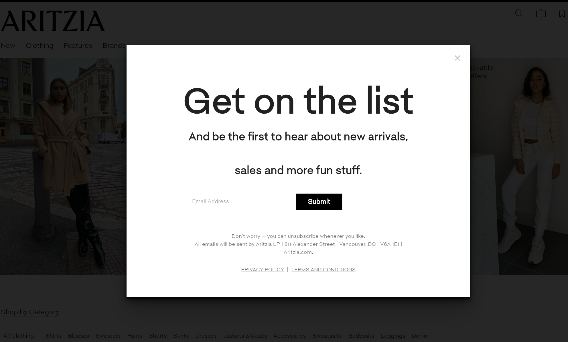
1. Email Capture
This is the general or a common form of email pop up where you just pop up a lightbox to ask visitors to enter their emails. This type of pop ups template is more effective when you are nicely presenting your services through webpage content and then showing up the email pop up to let visitors willingly provide their emails.
Read about email capturing best practices here.
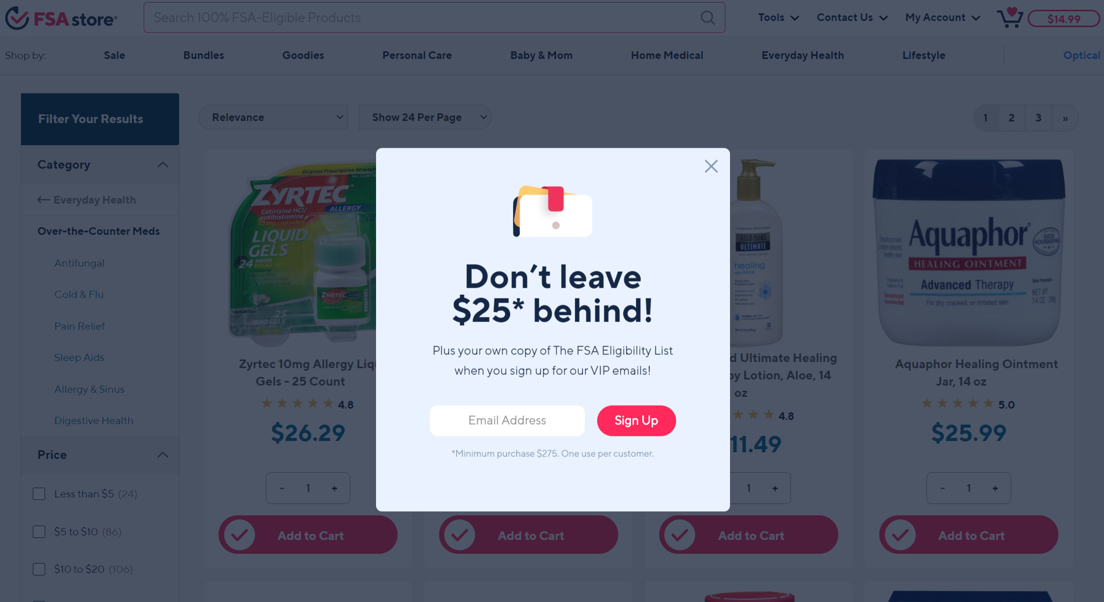
2. Coupons/Discounts popup
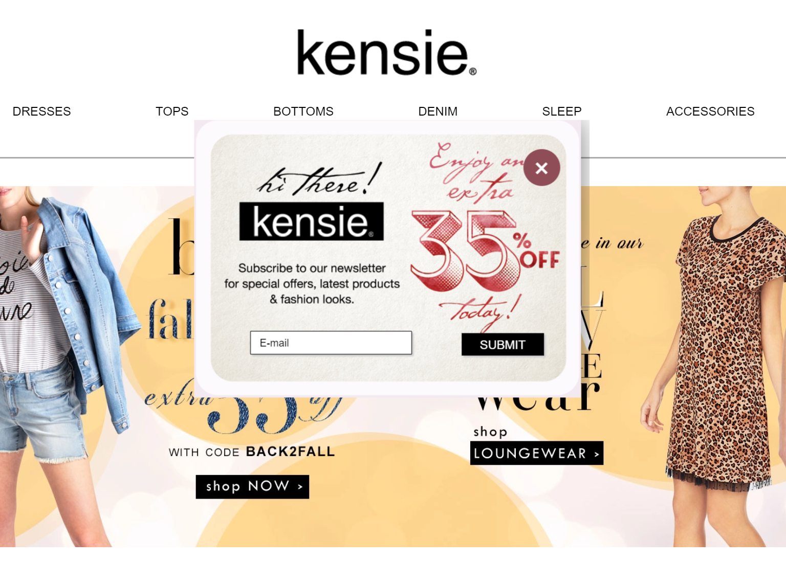
In this form of email pop up, you are giving coupons/discounts in exchange for visitors’ emails.
This approach is well-suited for e-commerce businesses or those who want an email popup for Shopify. The coupons/discounts approach is also an effective way to turn confusing visitors to make a purchase.
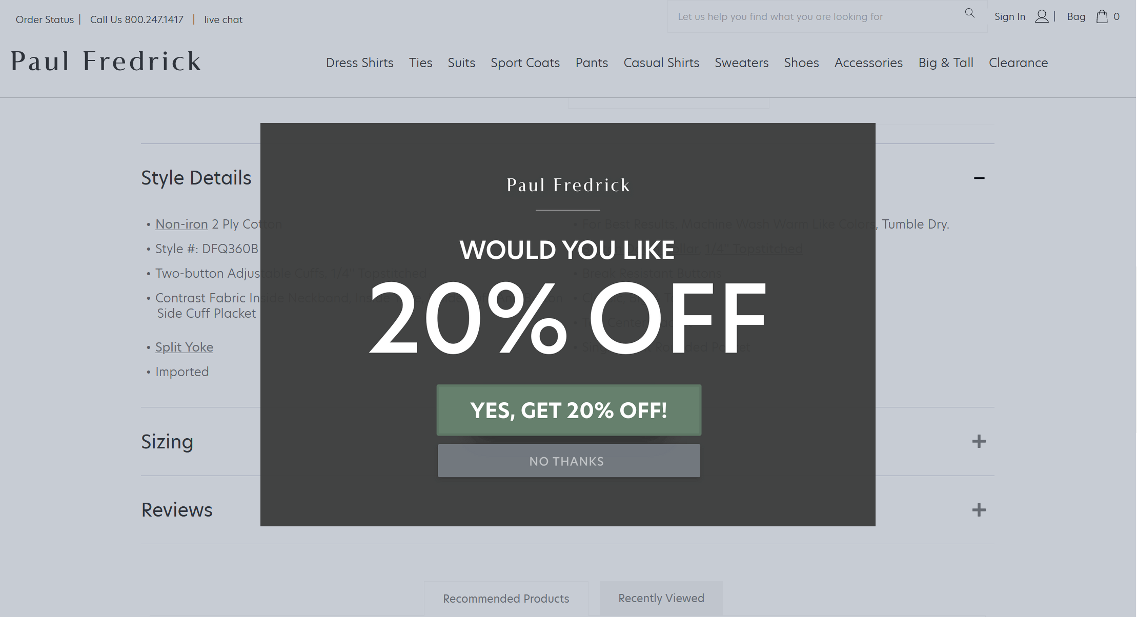
3. Lead Magnet
You will offer a product sample, eBook, or other services to the visitors if they provide their emails. You will send that content or item directly to their emails.
If visitors are not much interested in your services, then this approach may help to change their mind once they have got free service from you. Specifically, in the services industry, this kind of approach works well.
4. Exit Intent popup
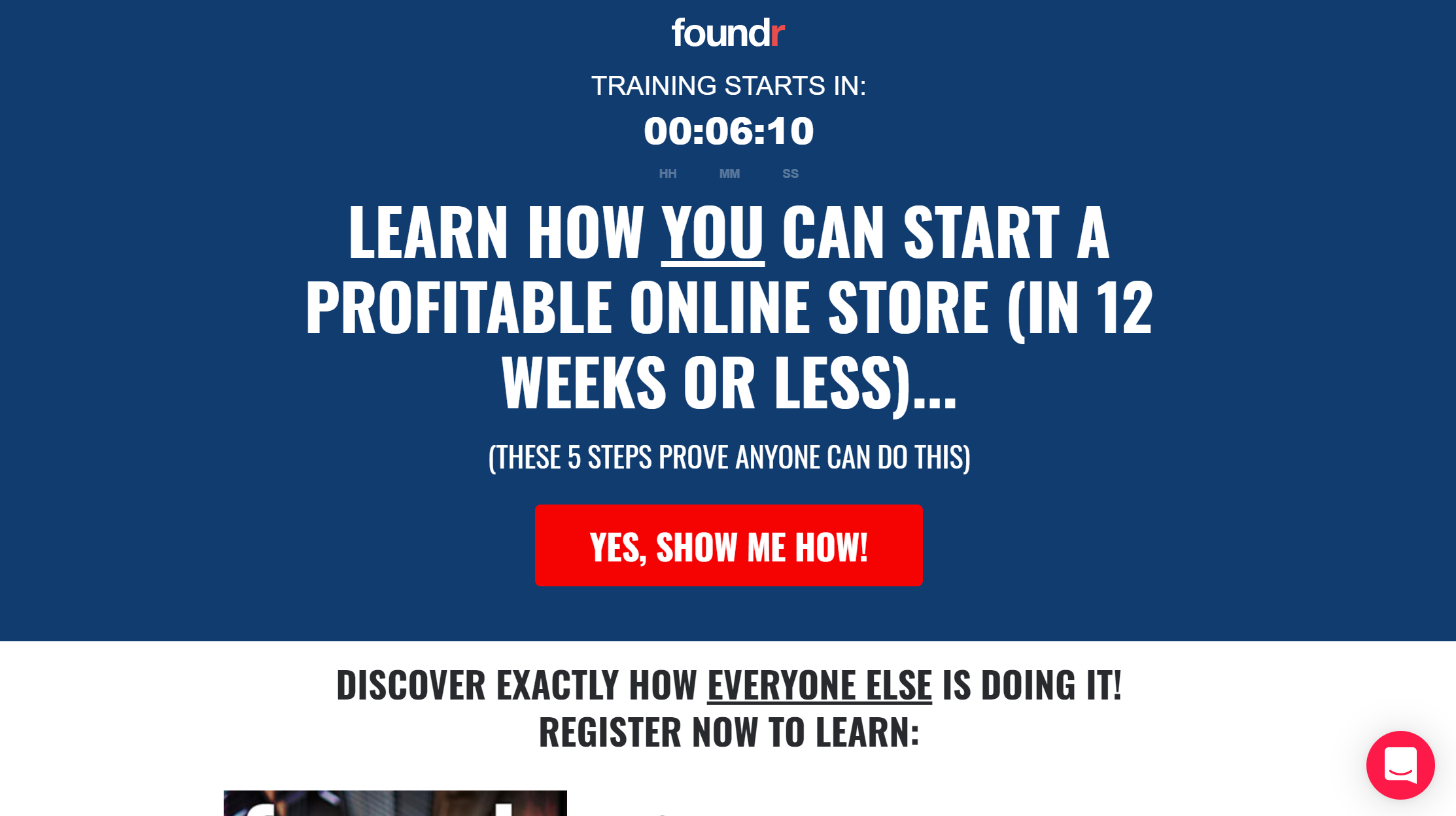
If a visitor is about to leave your site, then this email pop up form will appear. It is the last chance for you to show up something effective enough that makes the visitor provide his/her email.
Headlines are an important component for better conversions, we have captured the best exit intent popups headlines here.
5. Two-Step Approach to Opt-In
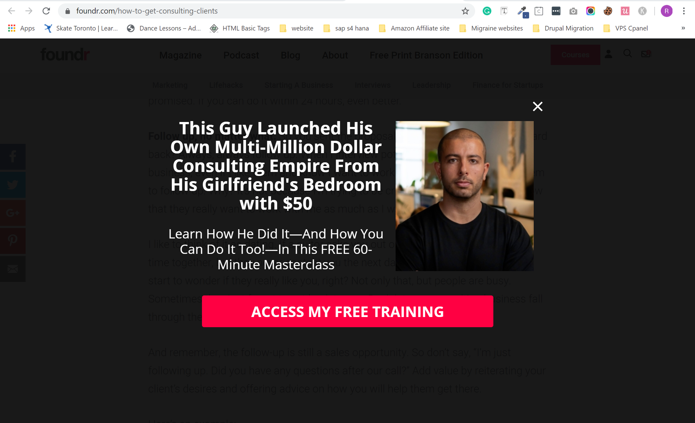
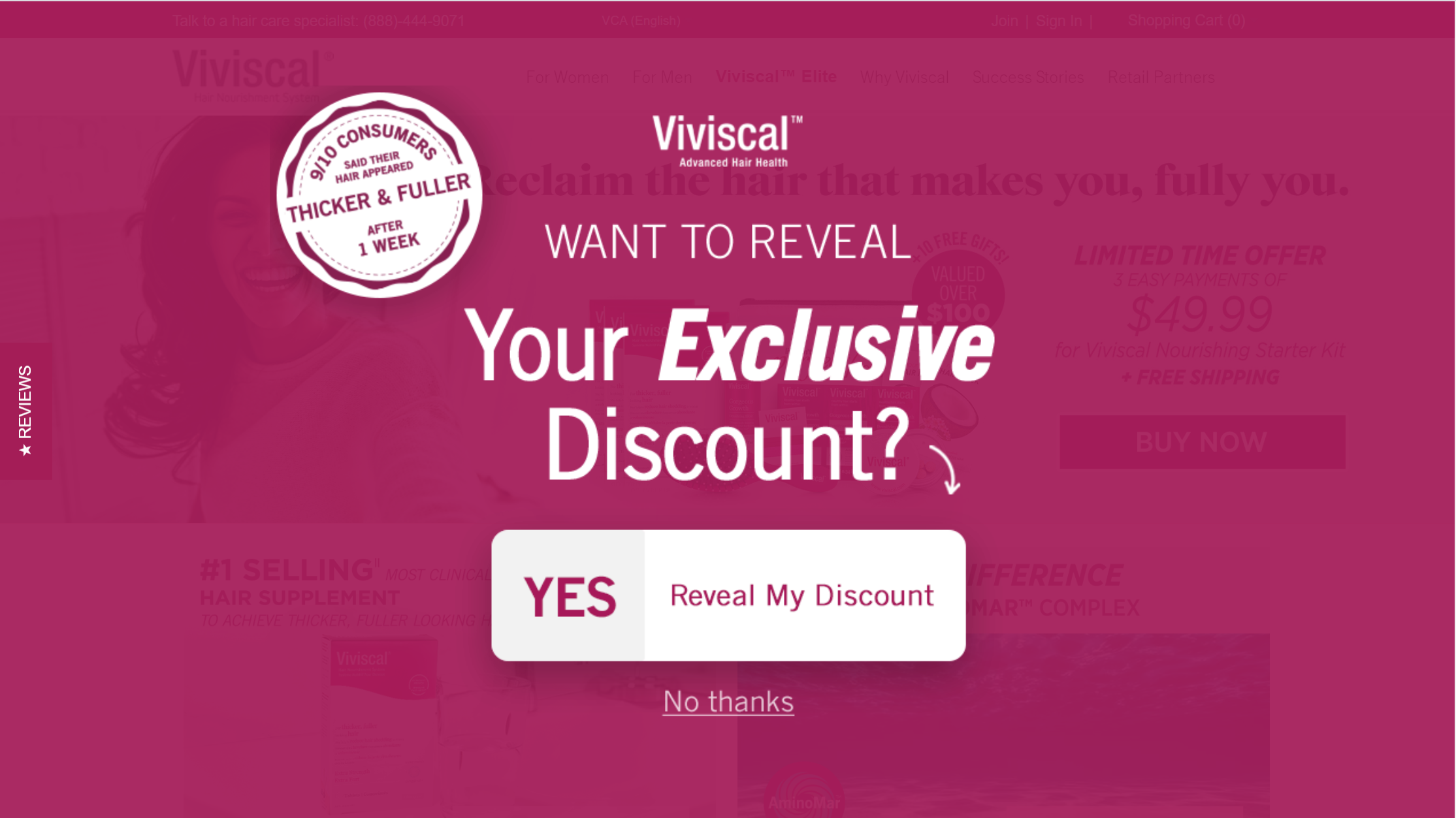
If you think that getting emails from visitors is a bit challenging based on your services/products, then you can go for a two-step approach to opt-in.
In this form, you will first gently give a Yes or No opt-in choice to the visitors. If the visitor’s press Yes, you will then ask for their emails. This is like a mind-game that often turns quite fruitful.
6. Giveaways
Less common but also an effective way to get emails. In this form, you will provide giveaways of your services/products but asking the emails first.
The Right Approaches towards Setting Best Email Pop Ups
Although email pop ups examples increase the signups and leads, the right strategies play a key role in making email popups a success. The above-mentioned types give the idea of email popups for WordPress, Shopify email popups, or other platforms, but they must be designed and narrated effectively.
Below are the key approaches that you should know for creating the best email popup:
1. The Right Timing of Popup
Timing is one single most important factor in the success of email popups.
Once a visitor is on your webpage, you should not pop up anything instantly. The best approach is to make the visitor engage with your content. When a certain time is passed, you should then pop up and ask for the visitor’s email.
Choosing the right time for an email popup examples is very important. You should not bring it too early and make your visitor get annoyed and go away.
Similarly, you should not pop up too late that the visitor might already have gone.
The best solution to find the one perfect time to pop up is to know how long visitors spend on your page.
Once you know the average time visitors spend, then you can set the email pop up to show when almost half of the average time is passed by the visitors.
2. Attractive and Eye-Catching Design
You have to make the visitors look into your popup message, and for that, you must present an attractive and eye-catching design.
Instead of making the visitors annoyed and forcing them to think about how to stop email pop-ups, your job is to make them at least look at the content inside the email popup.
In short, your email pop up has two jobs to meet.
It must blend itself to your webpage design and must be eye-catching to grab the attention of visitors.
The simple approach is to surround your email pop up content with some kind of attractive design, as shown in the below figure.
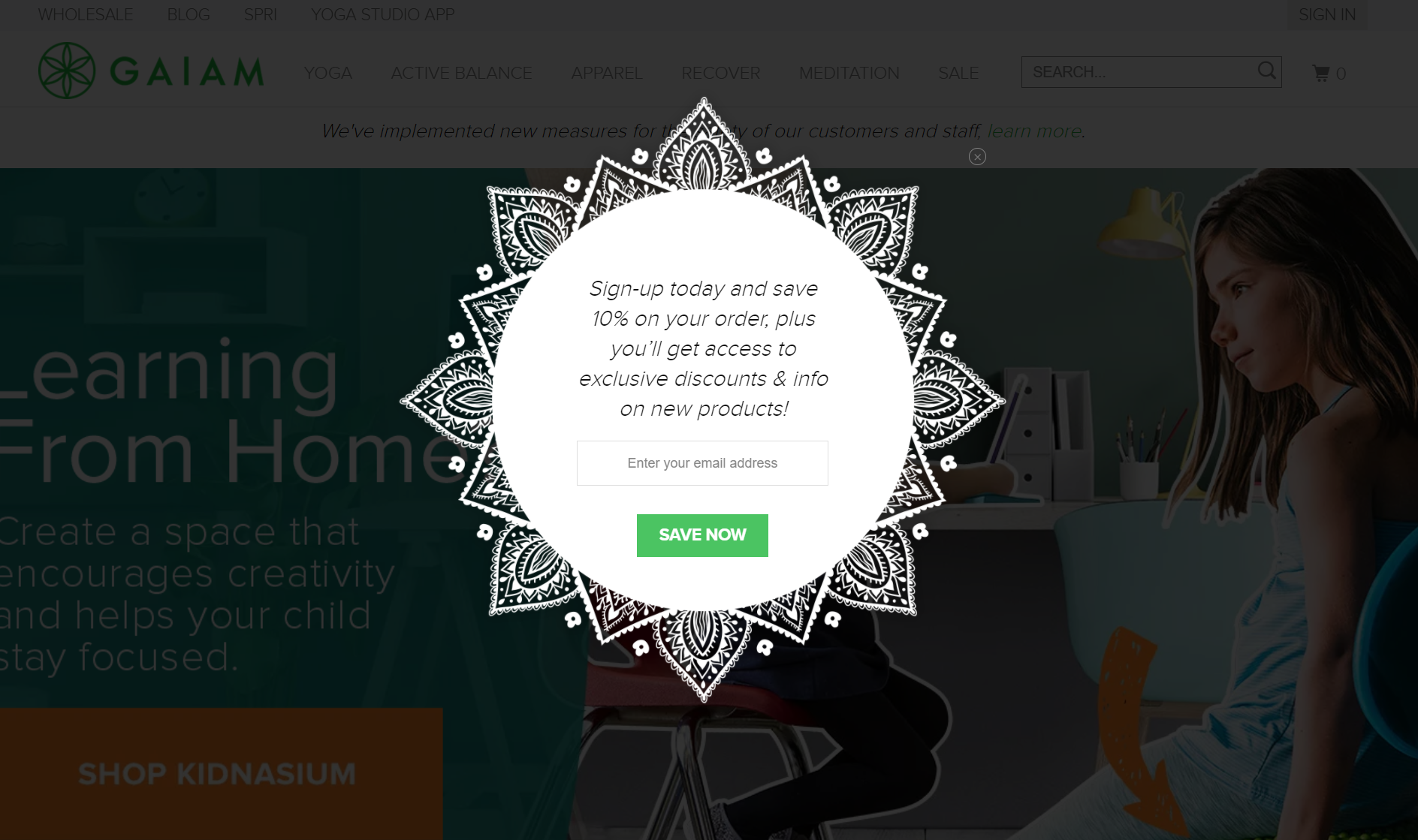
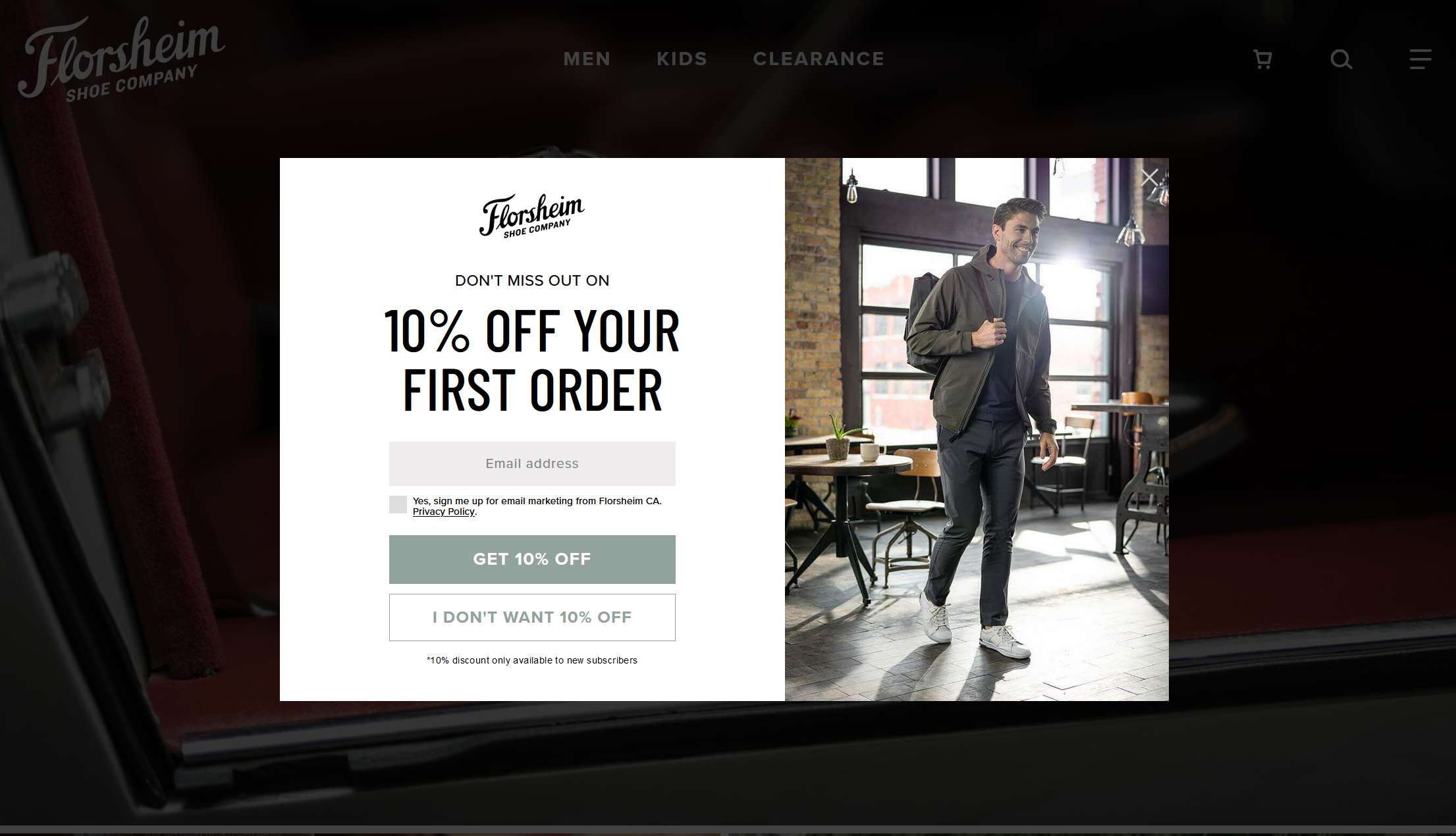
The more recommended approach is that you present the email popup along with a high-quality picture of the product and a discount, persuading the visitors to buy your products.
The more attractive your pop up design is, the more are the chances that the visitors will at least pay attention to it. So, you must ensure that whatever you want to narrate in the pop up must be visible to the visitors instantly with the right color choice.
3. Specific Popup for Different Segments
You should not just design only one email popup and use it whenever someone visits your main webpage.
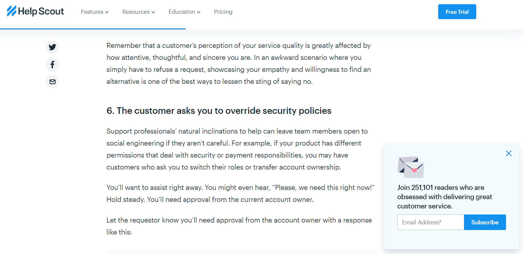
The right approach is that you design multiple email pop ups examples with different kinds of content, coupons, discounts, freebies, and similar others based on your products or services.
Once you have multiple pop ups examples, you can now allocate them to different sections of your website.
This way, when a visitor is spending some time reading about your specific service or product at that specific webpage, then a related email popup is more likely to convince the visitor.
If you are selling products, then a freebie or a coupon specific to that page can also show fruitful outcomes.
4. Strategic Coupons in Popups
Coupons or discounts is a great way to attract the attention of the visitors to the email popups WordPress.
A coupon of 10%, 20%, 40%, or 60% discounts with a nice popup message has been acknowledged to be the most effective way to grab the visitors.
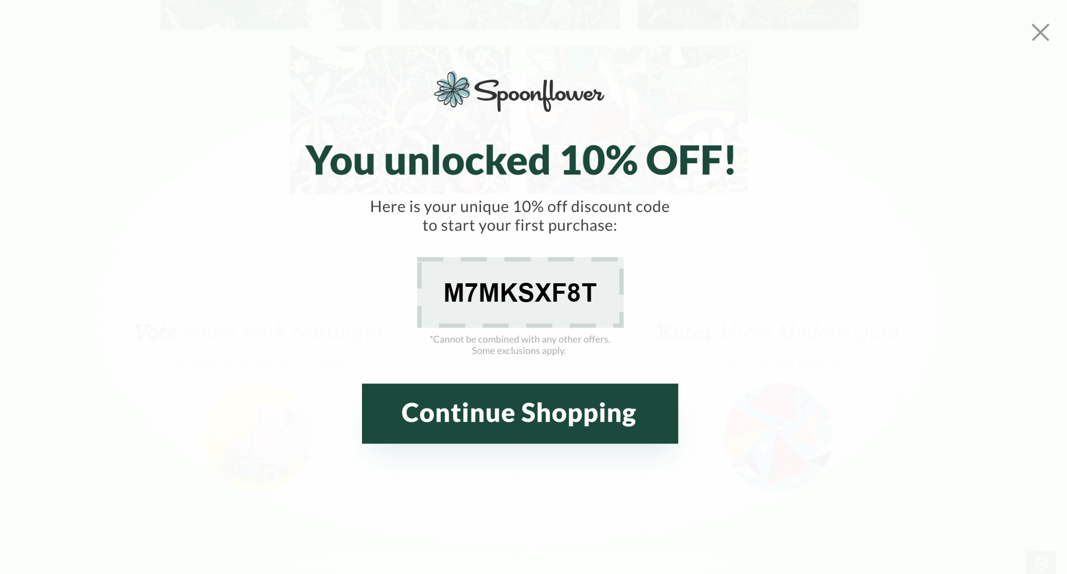
Other than discount coupons, you can also go for only free shipping or even combine both of them and try to convince the visitors.
5. Freebies in Popups
Everyone loves free things either it’s a sample of a product/service or a free training/eBook. You can test out both coupons and freebies strategies to see which one is productive for your business.
Because depending on your services/products, a free service can help you gain more subscribers, then coupon popups.
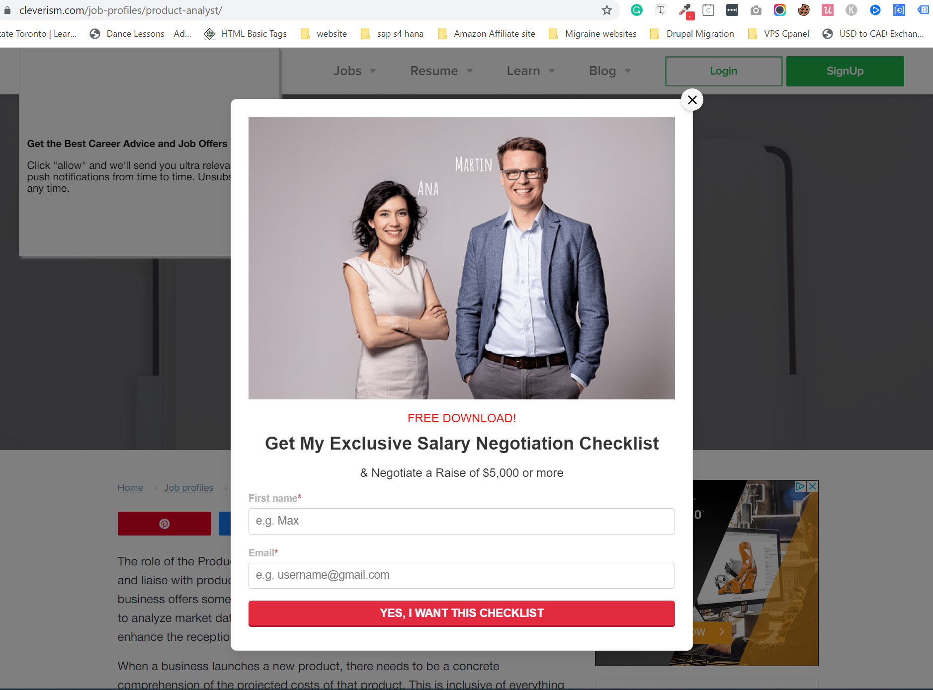
You can even offer both coupon and free service in a popup to gain the trust of visitors and make them potential customers.
6. Catchy Content
Content is the main key for all your email popup strategies. If you are placing the popup at the right timing with attractive designing and coupons, but your content lags attraction, then your efforts can go in vain. You should know that if a visitor is visiting your webpage, then what he/she actually wants to see.
Your webpage content should be the first catchy thing and then your popup should finally make him/her provide the email.
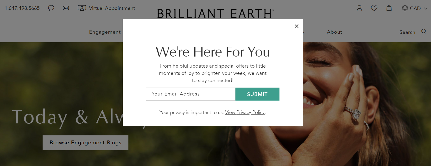
If you are confused about what content suits well for the visitors, then you can go for engaging them in your email subscription popup WordPress. You can ask a Yes/No question with catchy content and graphics to engage them and then ask for their emails.
7. Customize for Mobile Users
Our mobile usage has increased aggressively with the evolvement of social media platforms and other technological advancements. Therefore, email popups should not just be provided in desktop versions.
If you are marketing your products on social media and expect visitors to visit your webpage from their smartphones, then you must plan your mobile popups. You can use the same desktop popup designs for mobile with reduced sizes.
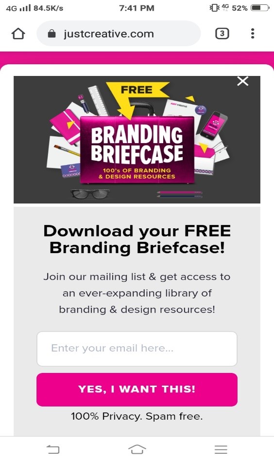
Usually, mobile popups cover a lot of the mobile screen, so you can also try to ask for emails at the end of your webpage instead of showing pop ups examples. This strategy can only work if your webpage content is attractive enough that the visitor reads it all the way till its end.
Conclusion
Email popup examples is one of the effective ways to increase your email subscriptions and generate more leads. But the way you present your popups will decide the success you are going to achieve. In this competitive digital world, visitors have multiple options to choose from. So, you should make your email popup strategies to be attractive, engaging, persuasive, and giving value to the visitors.
Therefore, the right timing, attractive design, catchy content, coupons, and freebies if used intelligently can guarantee you to get in touch with potential customers.
Join 1,000+ teams that love Qualzz


