10 exit-intent popup tips to increase sales
The E-commerce industry is growing worldwide with sales pegging at $3.5 trillion USD according to Shopify..
Exit-intent popups help to entice and attract the website leaving visitors and increase the online sales.
With the current trends and competition, it becomes extremely difficult for e-commerce brands to increase sales.
Exit-intent popups are in great demand among marketers to increase their conversion rates. There are various ideas to attract and motivate visitors on their website and get the desired results in the conversion process.
But not all the popups end up with the anticipated outcomes.
So how can we improve conversions?
Let’s look at 10 tips that we can choose to create the best exit-intent popups.
1. Discount offers
Customers are very versatile in their choices and are always seeing to get the best bargain for their money. They are always on the lookout to get better discount deals available in the market.
With the advancement of technology, it becomes extremely easy for the consumer to compare the prices and zero in on the least available price.
Being competitive in the market in terms of pricing is very important for the success of any e-commerce store. Adopt different discount strategies to suit your ideal buyer’s personas.
Exit-intent popups work effectively in converting the cart abandonment visitors to customers.
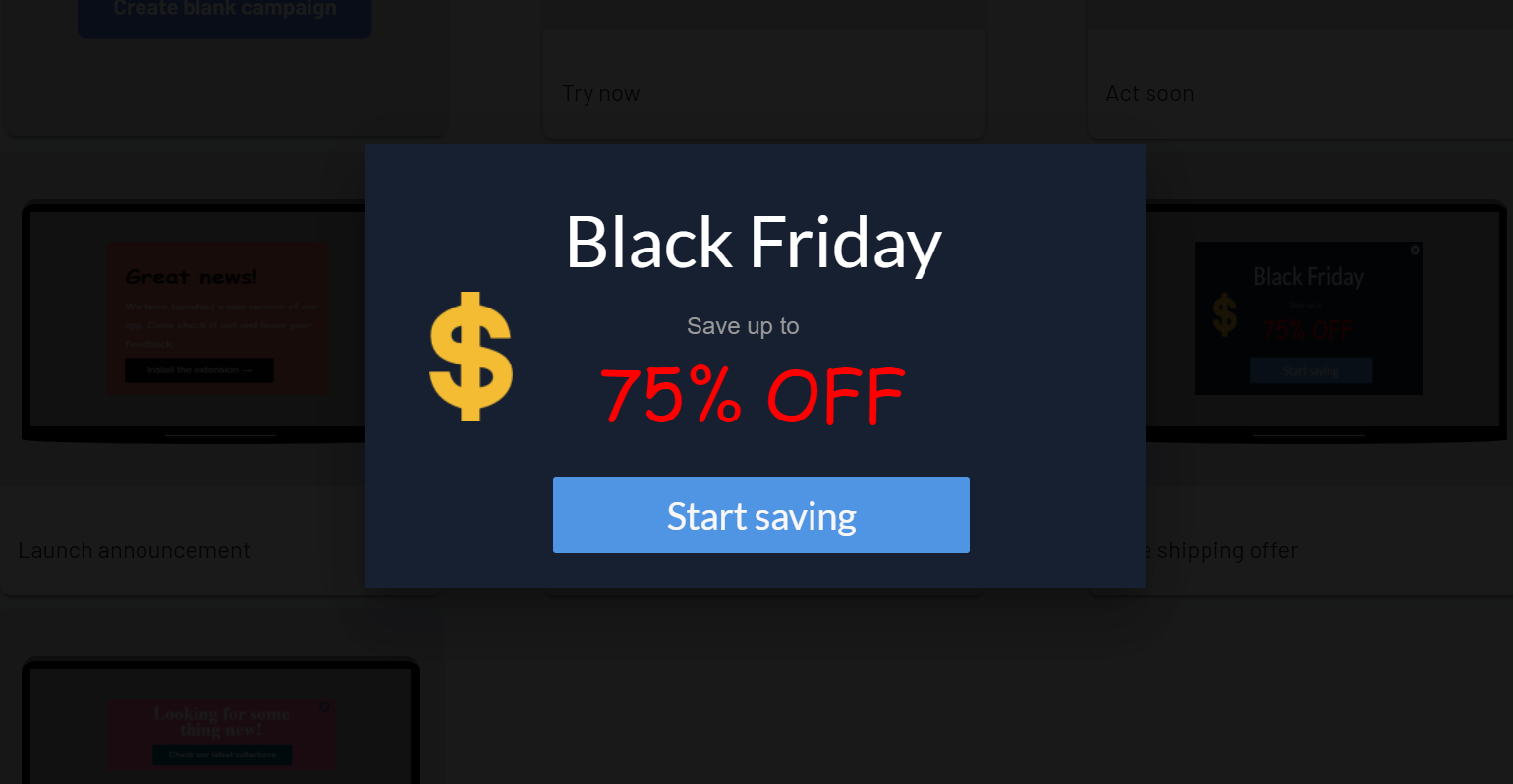
The discount popup is showed just before the visitor is about to exit the website from the cart page.
Showing the discount percent in bold and bright colors will attract and help in improving conversions.
2. Related products
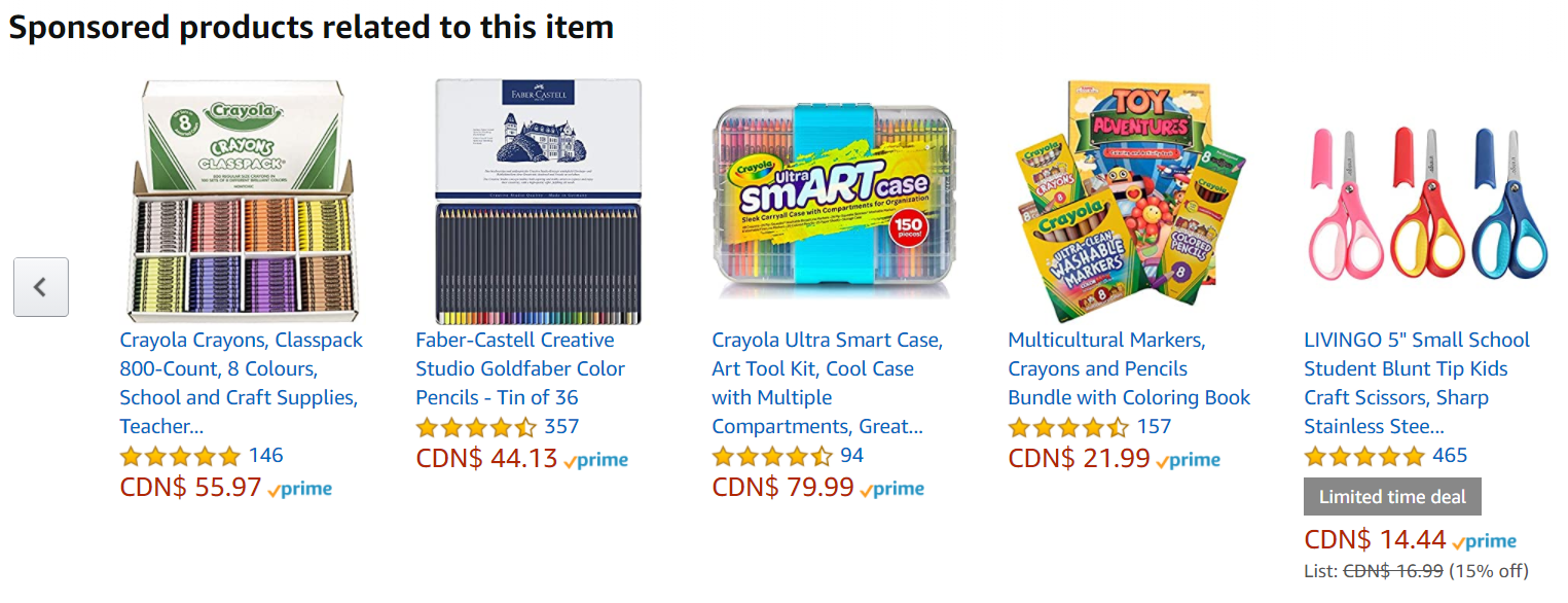
Recommending relevant and related products to its visitors on the e-commerce page will help in increasing product sales.
Consider a case where a visitor searches for a shirt on an e-commerce store and after a brief period, a popup offering jeans or trousers is shown. Showing related products with some discount offers can encourage customers to buy more.
Amazon does a pretty good job of showcasing this related products feature in increasing the sales.
It’s not just the discount price that attracts a buyer, it’s the value associated with the product which influences the buyer’s decisions.
Exit-intent popups work effectively on behalf of a brand to showcase the value it offers to its visitors and motivate them to make a buying decision.
Also Read – Popup best practices to capture emails
3. Bright color contrast
Designing a great converting popup is very essential in determining the effectiveness of the campaign.
We at Qualzz understand the importance of design in creating the popups. The Exit-intent popups can be designed as per our whims and wishes by using the simple drag and drop editor.
Using the right color to match the website brand is crucial. The bright colors on the CTA button go a long way in achieving the desired impact.
Bright colors are very eye-catching.
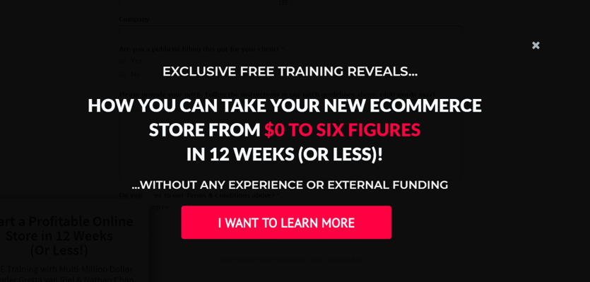
The above popup from Foundr shows the importance of having a bright red color CTA button.
Besides this when we give ‘yes’ or ‘no’ options within popups, the button indicating positive response should be designed in bright color and should stand out from the rest of the content. The negative CTA should be faded out to discourage the visitors from opting for it.
These exit intent popups can be triggered on various CMS like WooCommerce, Webflow, Shopify, Magento, WordPress, and BigCommerce.
4. Creating urgency
According to BJ.Fogg behavior model, consumer buying decisions are dependent on the three major factors Motivation, Ability, and Trigger.
Motivation to buy the product can be increased by providing value to the visitors.
The ability to buy the product can be met by offering a relevant discount.
Even the motivated visitor with an ability to buy the product might not make the buying decisions without a proper trigger. This trigger can be enticed by creating urgency.
We walk into a store and find a product that we did not plan to buy at that juncture. We found out that it is the last one in the shop?
The below words create a sense of Urgency:
-
- Limited Time
- Today Only
- Hurry Up
- Act Now
- Last Chance
- One Day Only
- Offer Expires
- Price Going Up
- Only 2 Left
Despite having no urgency, we quickly determine our minds and buy that in a hurry.
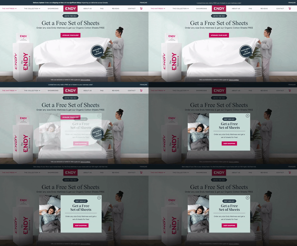
This theory is applicable to e-commerce exit-intent popup.
If merchants trigger popups with urgency words like ‘Hurry’
or
‘Limited time to avail a discount offer’
or
‘Free shipping only today’, proves to be highly converting.
6. Personalize interaction
Converting website visitors to customers is a goal that every business is striving to achieve. This makes the task challenging as every business tries to compete with its competitors.
In these scenarios, citing personalized copy elements in the popup copy which resonates with the current state of the visitor journey can create wonders.
If some words like, ‘hi’ ‘wait’ or ‘please take a glance’ come on the screen with popups, these can be effective.
For example- When visitors attempt to leave the page and the screen shows a popup with a bold text saying ‘Wait for a moment’ or ‘Before you go’.
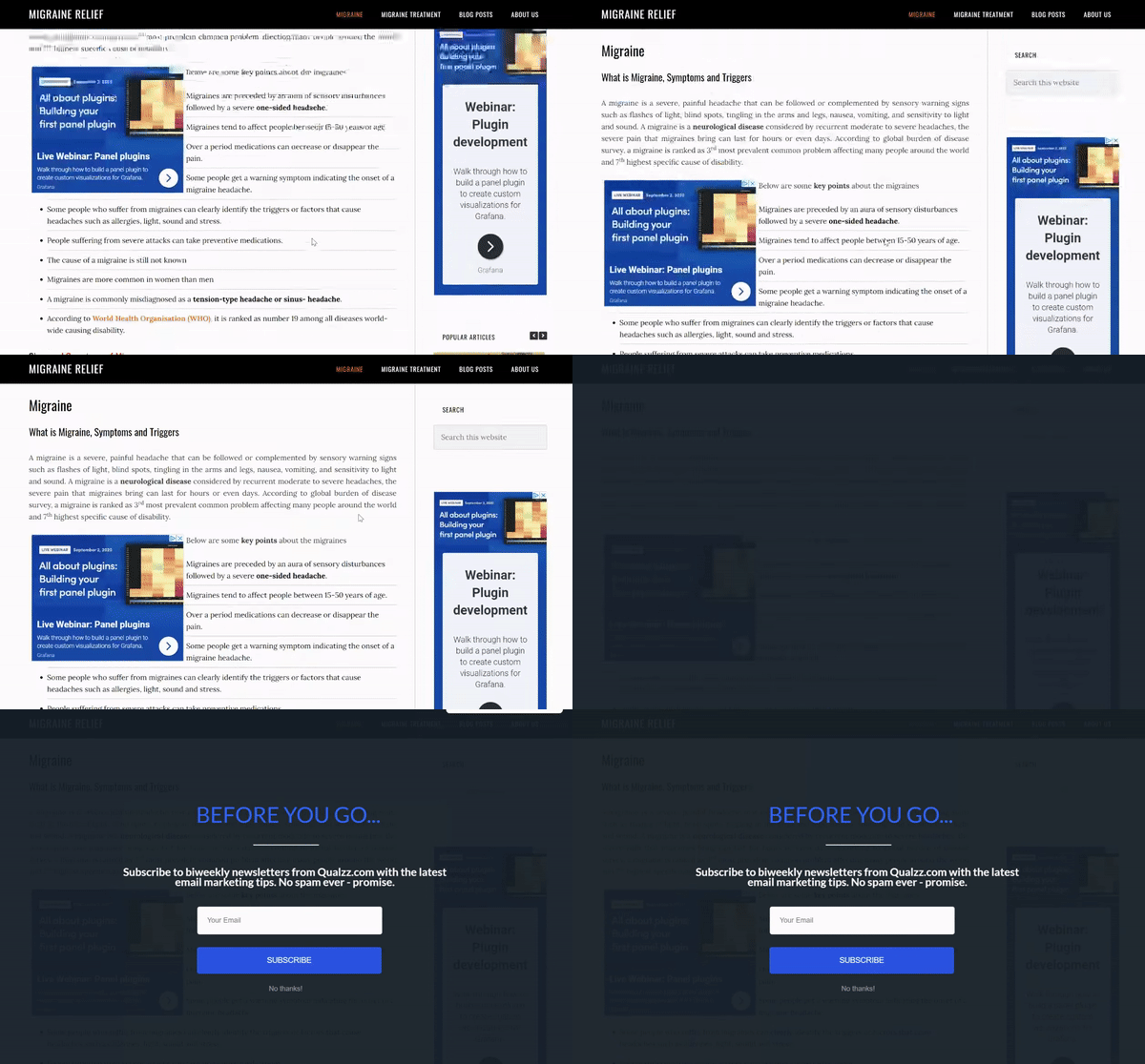
Smart blogger uses this word very effectively in their exit-intent popups. These texts make the visitor pause for a moment and tempt him to read the offer provided to him. This is purely based on the psychological state of the mind.
A repeat visitor can be personalized by the text displaying ‘Welcome back’ on a popup.
The visitors viewing these words feel very special and get connected with the brand.
5. Right offer to right customers
Providing the right offers at the right time to the right customers is very crucial in maximizing the profits of an e-commerce store.
The psychology of a new visitor differs a lot from the repeat visitor or existing customer. Providing the same offer to both the set of visitors may end up with bad conversions.
Tracking a customer during the time they visit a web page is an imperative element in triggering the popup campaigns. we must be sure if they are existing customers or not. If they are already included in the customer’s list, the popups should be specific to their needs.
Qualzz provides an option to target the visitors based on the buyer’s journey.
We can create two different campaigns targeting specifically to these sets of visitors.

Returning visitors can be targetted based on the number of hours, days, and months to be eligible to view the offer.
7. Offer to chat
When a visitor is looking through a web page without any action, it may be a sign that he is facing some problem to take decision.
Maybe he wants to know more about the products being offered or have some queries to be answered.
At this time a popup can be shown offering a one to one chat.
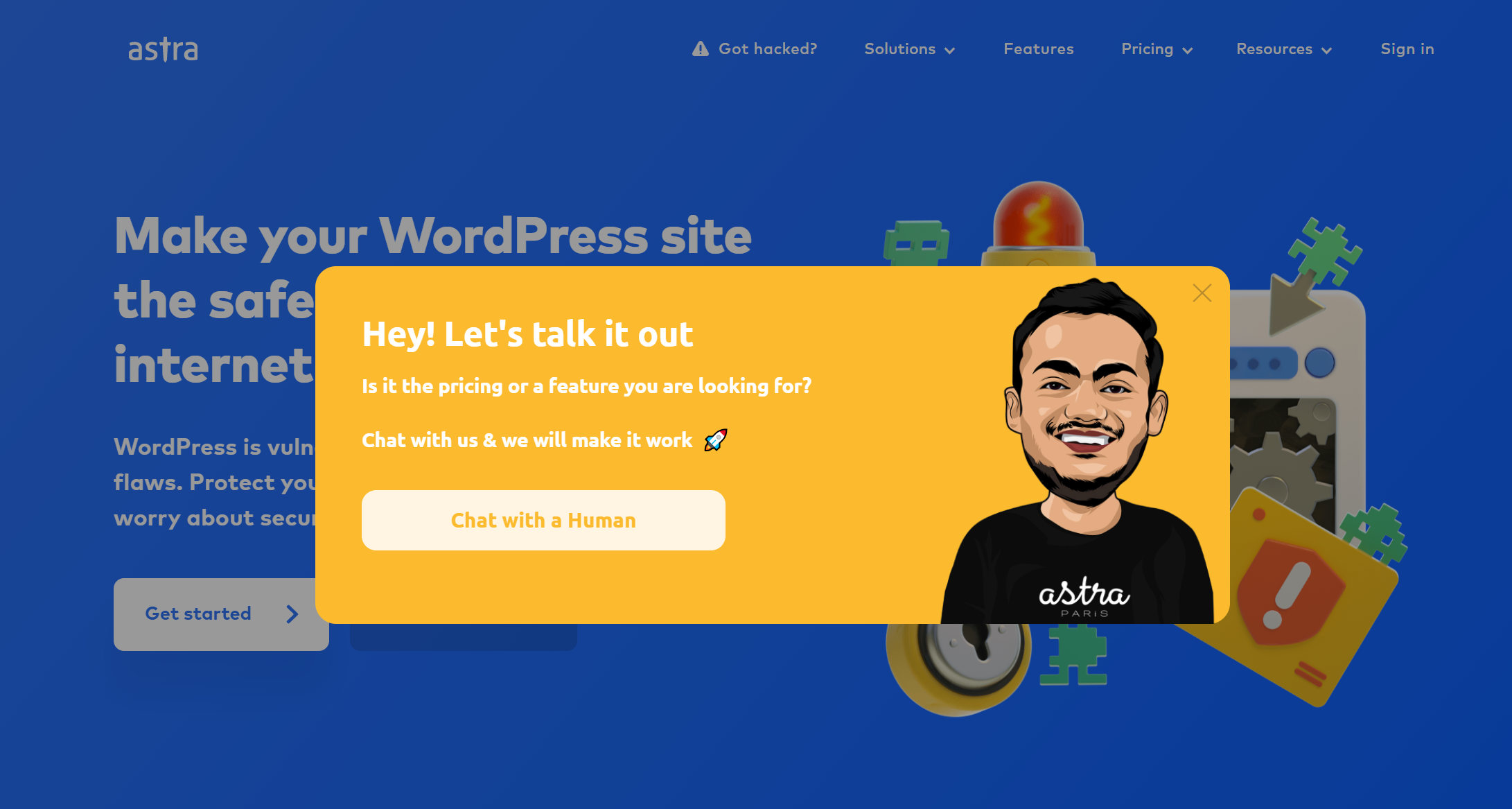
A well-known website security SAAS company GetAstra uses this approach to weed out any ambiguity a website visitor may have by offering an opportunity to chat with a human.
This is no doubt a wonderful way to provide value to your visitors. The attractive cartoon image of a human provides a hint of humor as well to the offer.
We will read more about the humor aspect further in the article.
9. Quiz
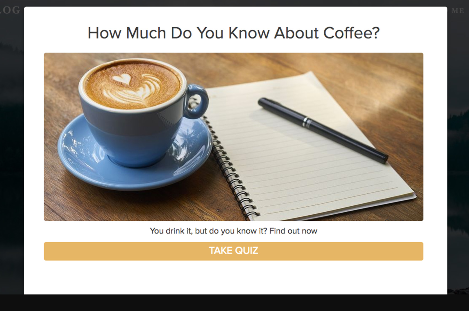
Exit-intent Popups conversions can be increased by engaging visitors with a quiz. Many visitors have an instinct to answer the small format quiz and cannot resist it.
If an exit-intent popup carries a simple question, it will be attractive.
The questions must be short and designed with a bold font with a minimal style.
A space for the email should be there with ‘yes’ and ‘no’ options to reply.
8. Humor
When a visitor is looking through a web page without any action, it may be a sign that he is facing some problem to take decision.
Maybe he wants to know more about the products being offered or have some queries to be answered.
At this time a popup can be shown offering a one to one chat.
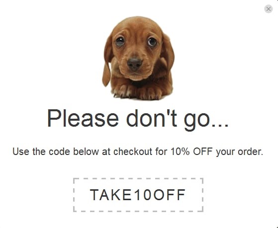
The below popup example carries great humor and cuteness with an image of a puppy and a discount offer in its content.
10. Unique idea
A popup, if designed with a unique and creative idea, looks more attractive.
Qualzz allows you to enable your creative juices flow while designing the popup. Create a great exit-intent popup for Webflow designed websites.
To survive in the competitive market a unique design is required. The uniqueness could be an effective use of product image or the content in the popup.
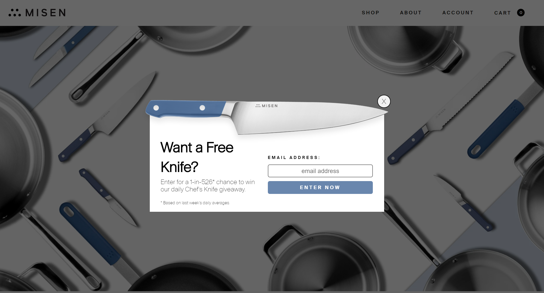
Look at the above popup design by Misen, the idea, and the brains behind the design certainly need to be applauded.
The unique way in which they used their product to showcase the popup goes miles ahead in attracting the visitor’s attention.
There are plenty of opportunities to create unique and attractive designs of popups. One can use their imagination and come up with an innovative idea and create designs using Qualzz Canva drag & drop editor.
While designing the popup it is imperative to keep in mind the above tips and create a unique offering to meet ones business specifications and grow e-commerce revenue.
Join 1,000+ teams that love Qualzz
